
Editorial note: This article was originally published on My Inner Creative and has been updated and republished in May 2026 under The Vessel’s editorial standards.
A rainbow spread runs the seven colours of the visible spectrum across a page in some order and uses them as a structural element. The colour is not only decorative. In most of the spreads collected below, each band of the rainbow stands for something: a day of the week, a month of the year, a category of task, a mood, an hour of the day, a habit being tracked. The result is a page where the structure can be read at a glance — the journaler does not need to read the words to see what each section is for. The colour does most of that work.
The spreads collected below were originally featured on My Inner Creative as a survey of how planners and bullet journals have used rainbow palettes inside their pages. They include weekly logs, monthly calendars, habit trackers, mood trackers, and decorative spreads where the rainbow itself is the subject rather than the organising device. The visual register ranges from soft watercolour bands to bright marker stripes to paper-cut layered shapes.
What “rainbow” means in this context
The rainbow has more than one meaning, and bullet journal spreads tend to carry several of them at once. There is the literal weather phenomenon — light refracted through water droplets into a visible spectrum. There is the long folk association with hope, optimism, and a brighter day after rain. There is the LGBTQ+ Pride flag and its variants, which have been part of the visual vocabulary since the late 1970s. There is the rainbow as a shorthand for childhood, for inclusivity, for celebration of any kind. None of these are mutually exclusive. The same drawn arc on a notebook page can carry whichever combination of meanings the journaler intends.
For the practical purpose of organising a page, the meaning of the colour matters less than the sequence. Rainbow palettes are useful because the order — red, orange, yellow, green, blue, indigo, violet — is easy to remember and easy to read. A page that uses the sequence as its structure inherits the order without having to invent one.

Colour as a way of telling time
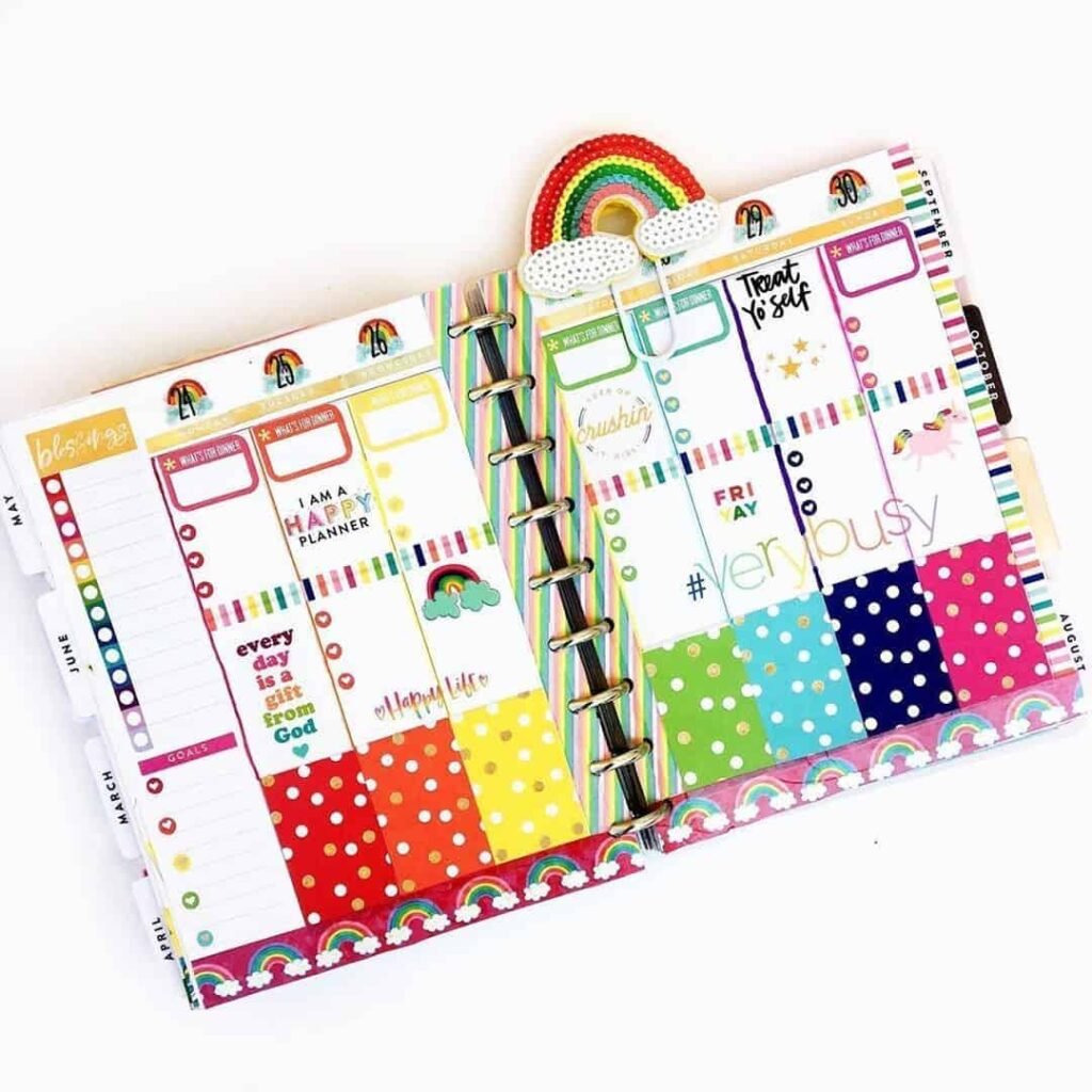
The most common functional use of a rainbow palette in the gallery is to map the days of the week. Monday is red, Tuesday orange, Wednesday yellow, and so on through to Sunday in violet — or some other consistent ordering the journaler picks once and keeps. A weekly spread coloured this way is readable without labels; the day is identifiable from the colour alone, and the colour is the same on every weekly page across the year. Habits, tasks, and events written in the corresponding colour automatically attach to the right day.
A second common use is to map months. Twelve months do not fit neatly into seven colours, so journalers either double up — using gradients between the rainbow stops — or extend the palette with pinks and earth tones to fill out the year. The monthly mapping turns a year-on-one-page spread into a visible record of which months hold more or less of whatever is being tracked. A year of work logged in green is a year that lived disproportionately in the middle months.
A third use is to map categories. The journaler picks a category (health, work, family, finance, learning, projects, rest) and assigns each one a colour from the spectrum. The page is then colour-coded across every entry. The advantage of the rainbow palette over an arbitrary set of category colours is that the journaler is unlikely to confuse a category — the spectrum order is so familiar that the assignment sticks.

The visual vocabulary
The visual style of a rainbow page varies considerably across the gallery. The most common technique is washi tape laid in parallel bands across the page, with the practical content written on top of or around the colour. Washi tape is fast, forgiving, and the bands stay visually consistent from page to page. A close second is solid bands drawn with marker or coloured pencil, which take longer but allow finer detail.
Other techniques include watercolour washes, which produce softer transitions between colours; paper-cut layered shapes, where each colour is a separate cut of paper glued in place; and pencil shading, which produces the most subtle palette and the most time-consuming pages. The technique the journaler chooses is generally a matter of what they enjoy drawing rather than what the page strictly needs.
The palette itself also varies. Some spreads use the traditional saturated ROYGBIV; others use pastels, neons, muted earth-tone interpretations, or two-tone gradients that suggest the spectrum without using every colour. The seven-colour version is the most recognisable; the others trade that recognisability for a different mood.

Pages where the palette works well
The format suits any page where structure benefits from being readable at a glance. Weekly spreads, habit trackers, mood trackers, monthly overviews, year-on-one-page calendars, and project boards all appear in the gallery below using rainbow palettes for their organising structure. Pages that do not benefit as much — long-form notes, reading entries, single-task lists — tend to use the rainbow only as a decorative accent rather than as a functional element.
The format does not add information; a habit tracker shaded in rainbow colours does not record more than the same tracker in plain pen. What it adds is legibility. A glance at a rainbow-coded page resolves to its structure faster than a glance at a monochrome page, and over a year of weekly pages that small saving in attention accumulates into a notebook that is easier to keep using.
Featured rainbow planner spreads
The spreads below were selected to show the range of ways a rainbow palette can function inside a real page. The selection was made with three questions in mind: does the colour do structural work, or is it only decorative? Does the technique suit the palette — or does it fight it? And does the page read clearly at a glance, or does the colour add noise rather than signal? Not every spread below answers all three questions the same way, which is part of the point. The format is flexible enough that a washi-tape weekly and a watercolour mood tracker can both use the same seven colours and arrive at completely different results.
The spreads are grouped loosely by function: pages where the rainbow structures time (weekly and monthly spreads), pages where it structures content (habit trackers, category-coded logs), and pages where it is the subject of the page rather than its scaffolding (decorative and thematic spreads). Within each group the techniques vary — washi tape, marker, watercolour, coloured pencil, paper-cut — so the grouping reflects purpose rather than method.
Spreads where the rainbow structures time
Weekly and monthly layouts make up the largest share of rainbow-palette spreads in circulation, and it is easy to see why: the seven-colour sequence maps cleanly onto the seven days, giving the journaler a built-in legend they never have to explain to themselves. The spreads in this group use the palette as a navigational device — the day or month is readable from the colour before any text is read. Some use the full saturated ROYGBIV; others work in pastels or muted tones that carry the same sequence with a quieter visual weight.


What the spreads above share, more than any particular meaning of the rainbow, is the use of a familiar colour sequence as a piece of page structure. The seven bands carry the days, the months, the categories, or whatever else the journaler wants to organise. The colour does the navigating; the words do the recording. A page laid out this way takes longer to set up than a plain one, and the journaler is paid back for that setup time across the weeks and months the colour code stays consistent. By the end of a year, the same seven colours sit on dozens of pages, and the notebook reads as a single sustained piece of work rather than a sequence of separate weeks.