
Editorial note: This article was originally published on My Inner Creative and has been updated and republished in May 2026 under The Vessel’s editorial standards.
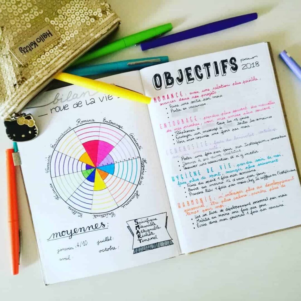
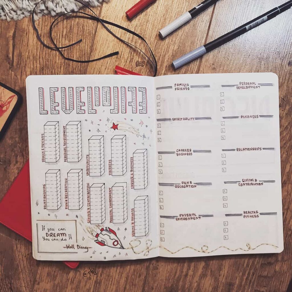
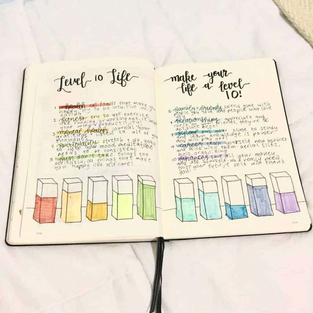
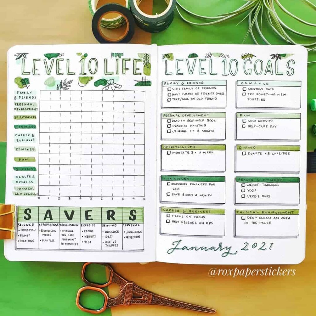
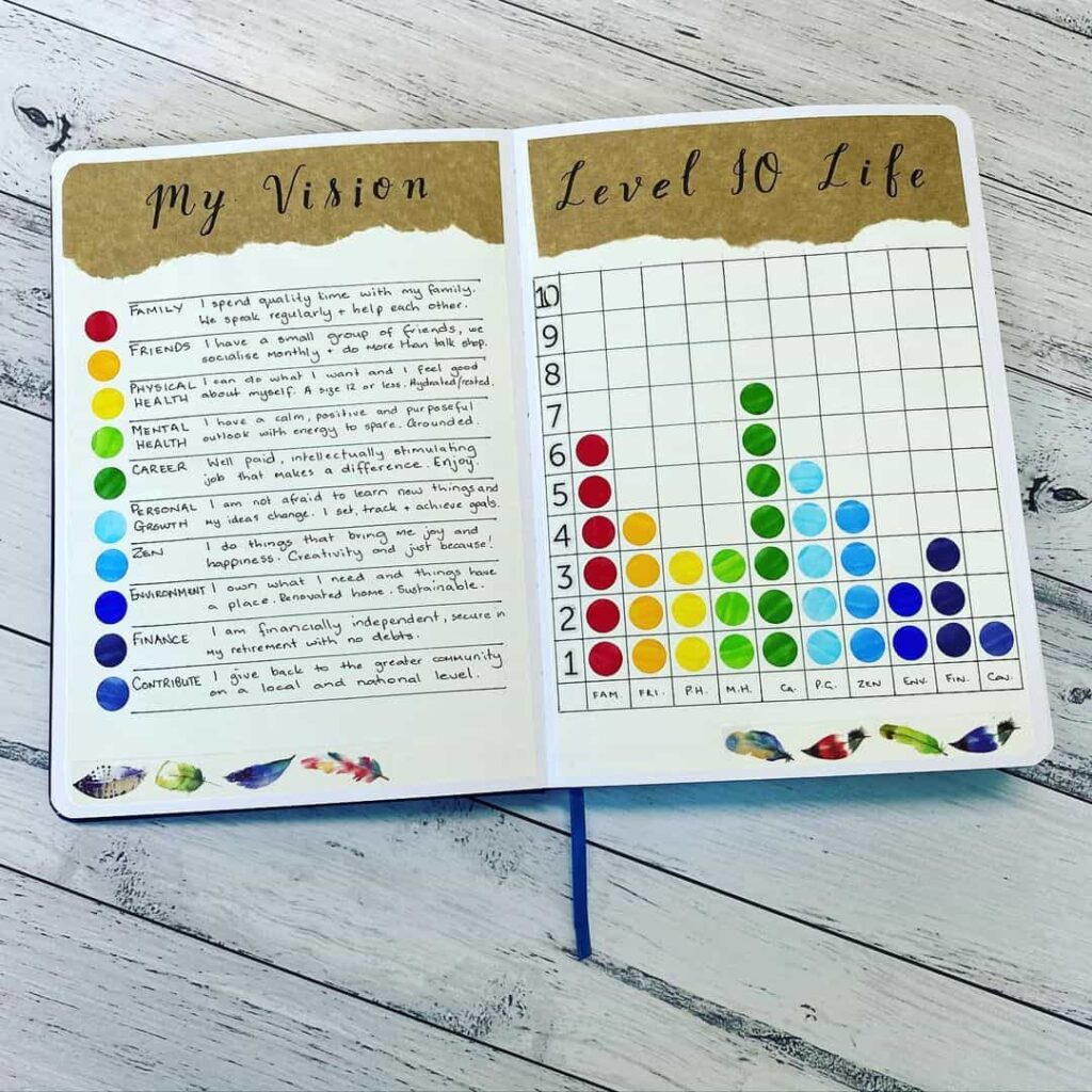
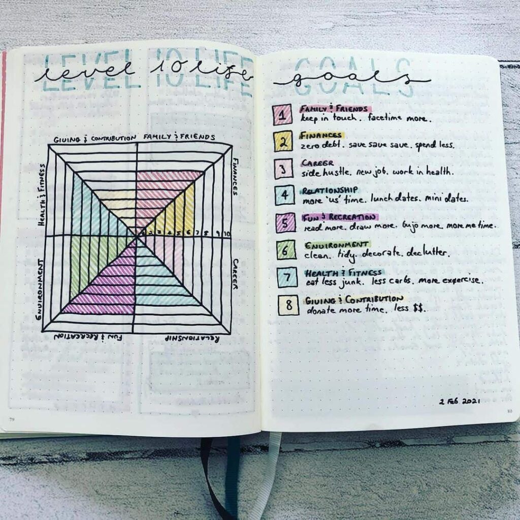
A Level 10 Life spread is a single-page self-assessment that breaks a person’s life into eight to ten broad areas — health, work, finances, relationships, and so on — and asks the journaler to rate each area on a scale of one to ten. The result is a snapshot of where the person feels well-resourced and where they feel under-resourced at a particular moment, drawn in a form that can be redrawn six months later and compared to the previous chart.
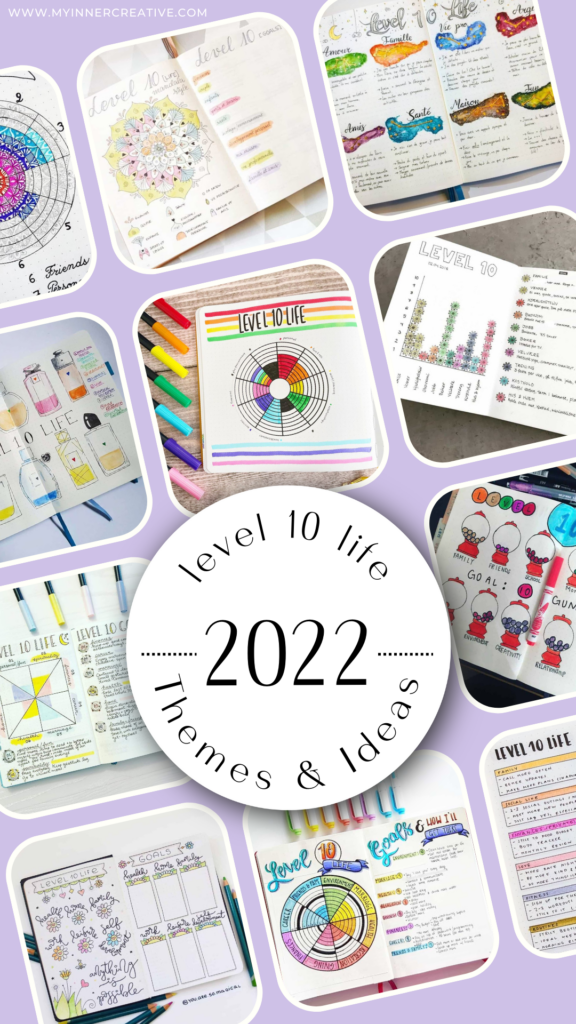
The spreads collected below were originally featured on My Inner Creative as a survey of how journalers lay out the Level 10 Life inside a bullet journal. They range from the standard concentric-wheel layout to creative interpretations involving mason jars, fireflies, gardens, and other metaphors that turn the chart into a more decorative page. The underlying exercise is the same in each: rate the areas, set a small set of goals against the lowest-scoring areas, and revisit the page on a regular cadence.
Where the method comes from
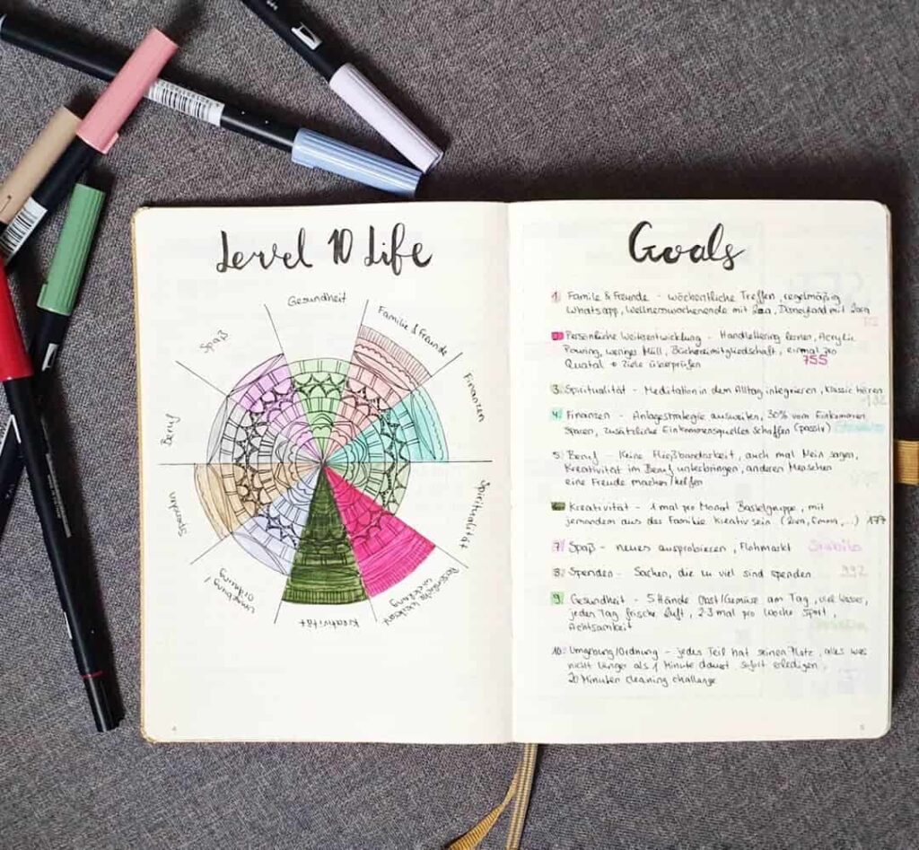
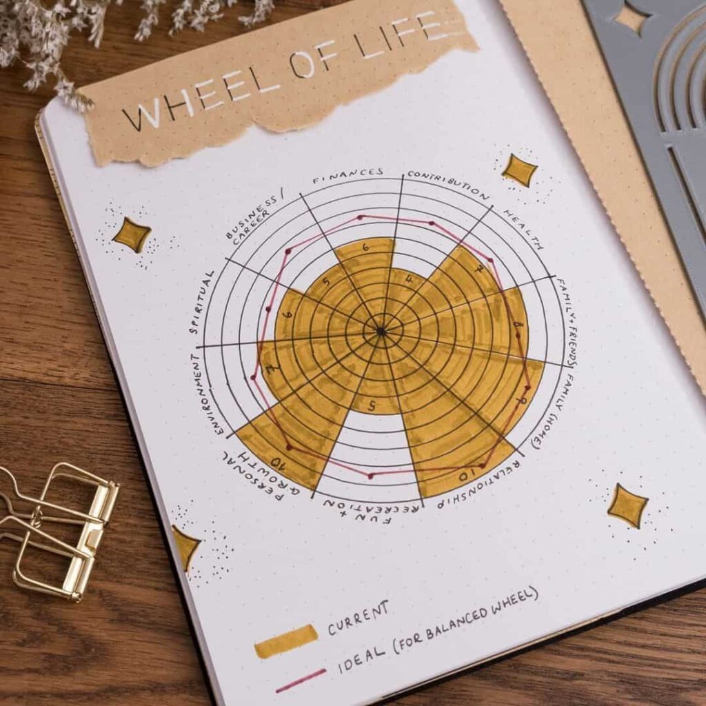
The Level 10 Life exercise is associated with Hal Elrod’s The Miracle Morning, which is where many journalers first encounter it. The chart in the book is itself an adaptation of an older coaching tool called the Wheel of Life, which uses the same broad pattern: a circle divided into wedges, one per life area, with the radius of each wedge indicating how the person feels about that area on the day they fill it in.
The method has stayed popular in part because it is simple and in part because it produces a piece of visible data — a chart with one or two short wedges next to several long ones — that is easier to act on than a vague feeling of “things are uneven.” The point of the exercise is rarely the chart itself; it is the small set of goals the journaler picks afterwards, aimed at whichever wedges turned out shortest.
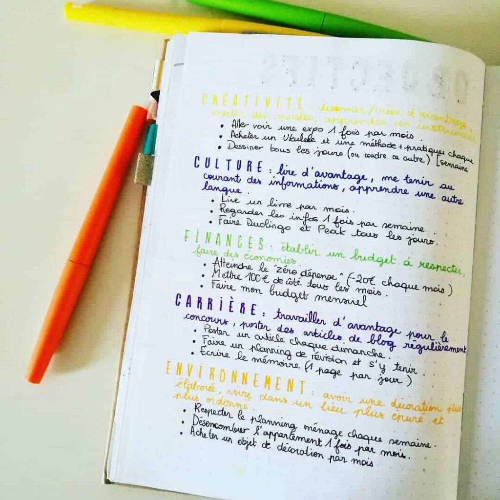
The ten standard areas
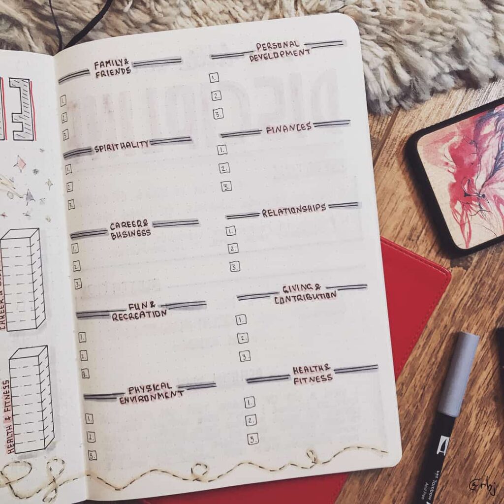
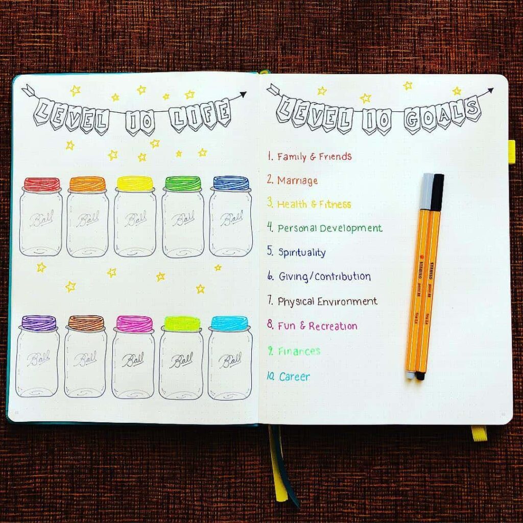
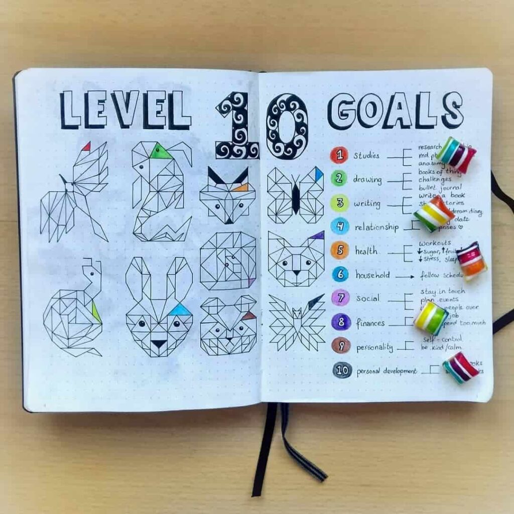
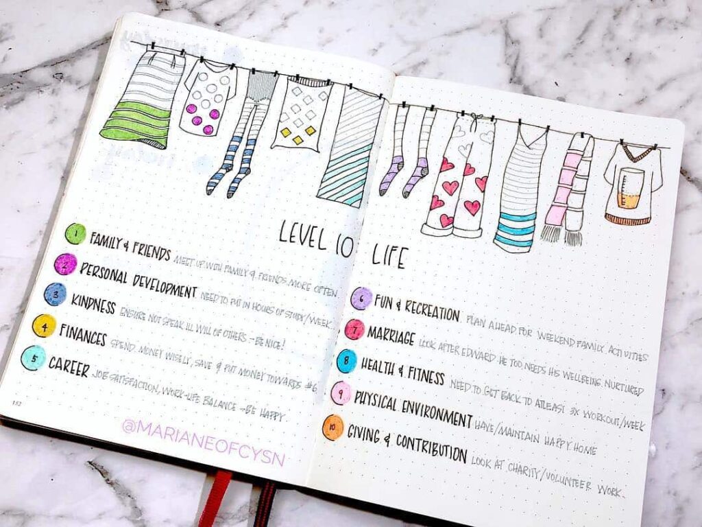
The original book breaks life into ten areas. The list is a starting point rather than a rule, and journalers regularly swap one or two of the headings for categories that match their own life better. The standard ten are:
- Spiritual — inner life, sense of meaning, sense of connection.
- Career — daily working hours and what they amount to.
- Finances — income, savings, debt, the state of the budget.
- Physical environment — the state of the home, desk, car, surroundings.
- Health and fitness — food, sleep, movement, energy.
- Fun and recreation — play, rest, time off.
- Personal development — reading, learning, expanding interests.
- Friends — the friendships that get attention each month.
- Family — relationships with parents, siblings, children, extended family.
- Significant other — partnership, romance, or dating life.
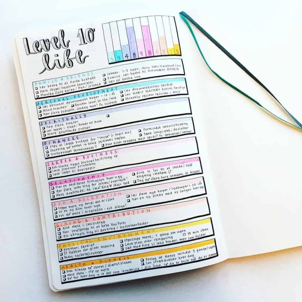
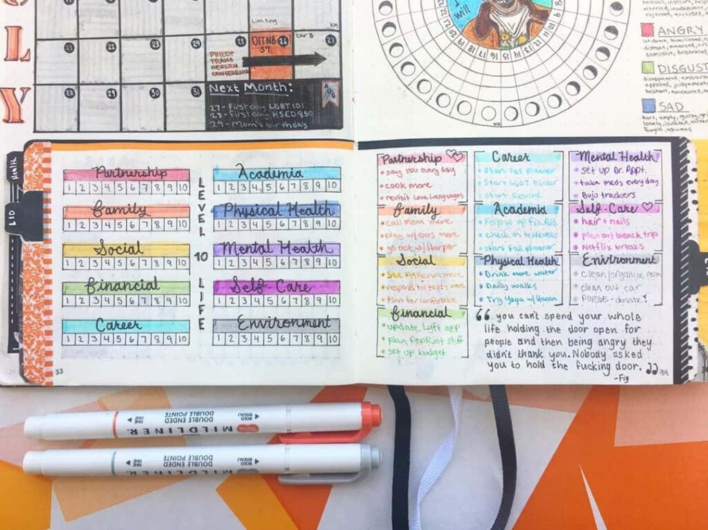
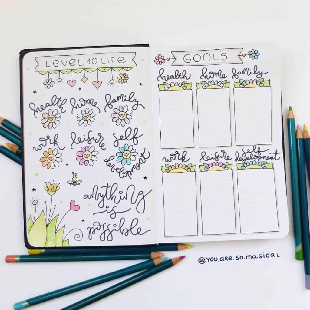
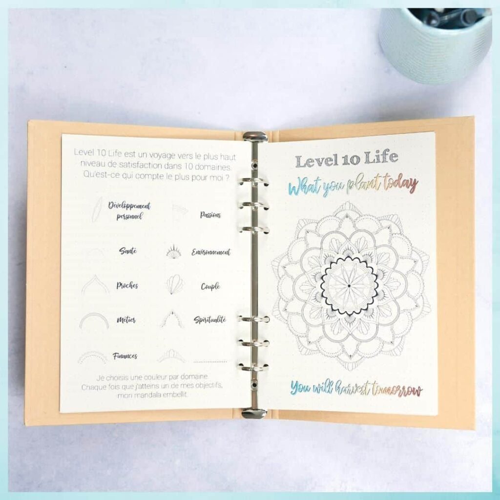
Common substitutions in the spreads below include travel, mental health, pets, creativity, education, and community involvement. The chart accepts whatever headings the journaler considers important; the exercise is more useful with categories that reflect the person’s actual life than with a forced fit to the original ten.
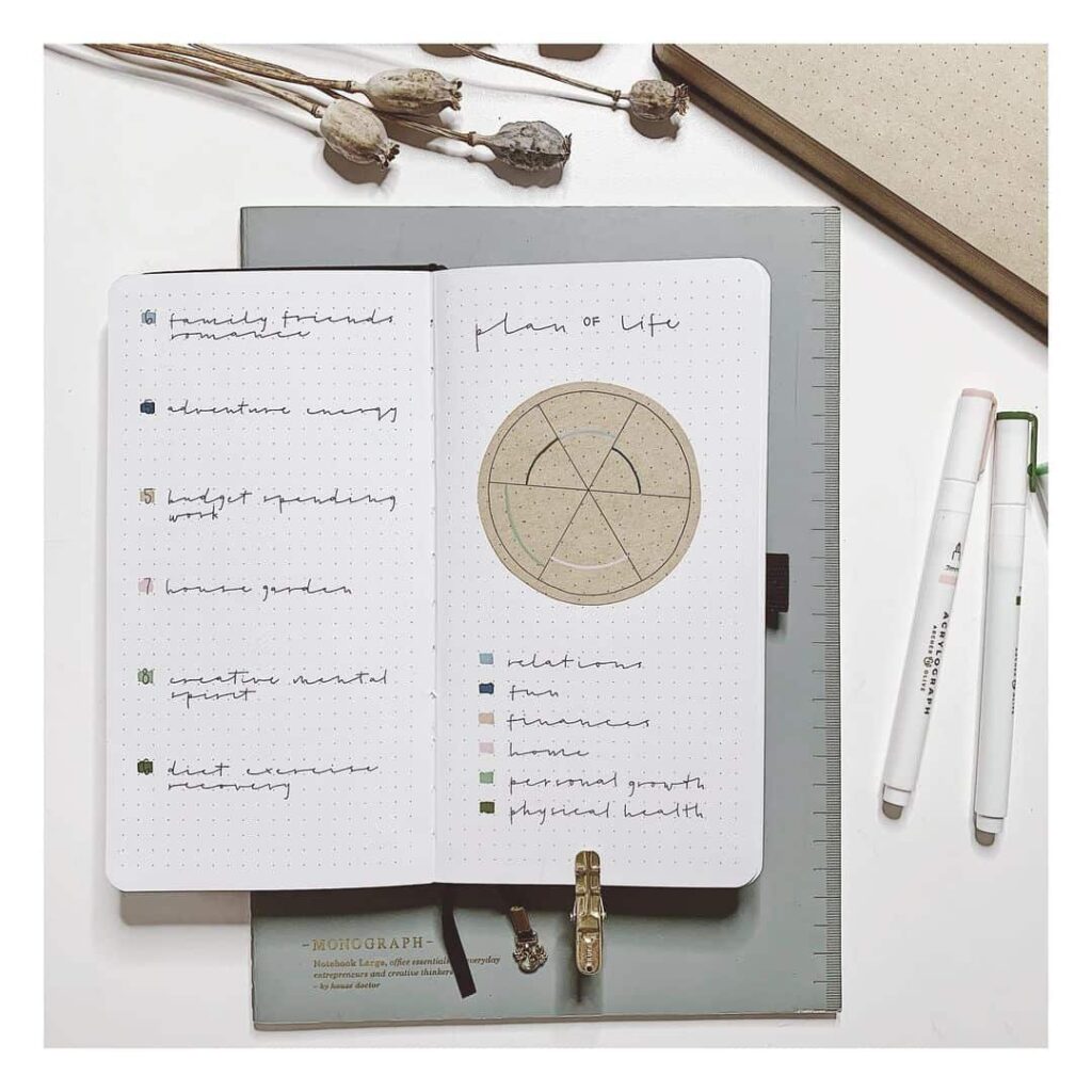
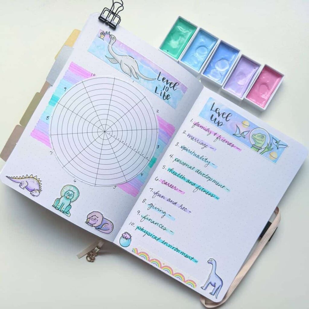
How a Level 10 Life spread is typically drawn
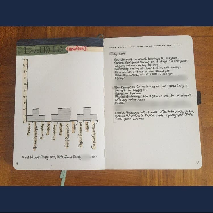
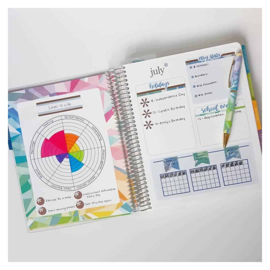
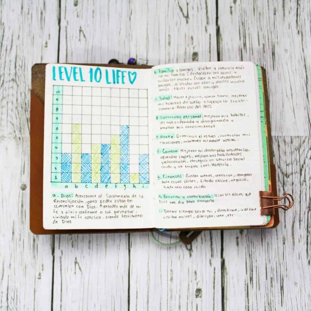
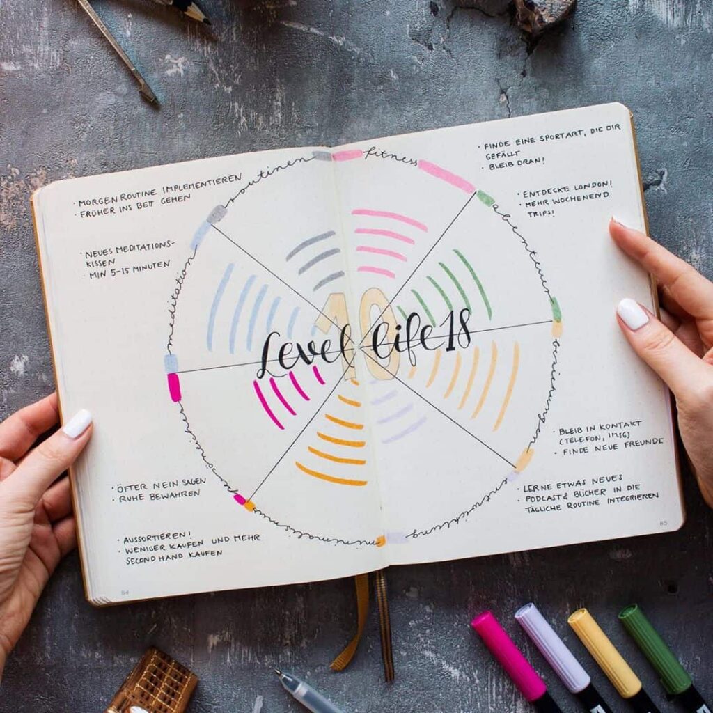
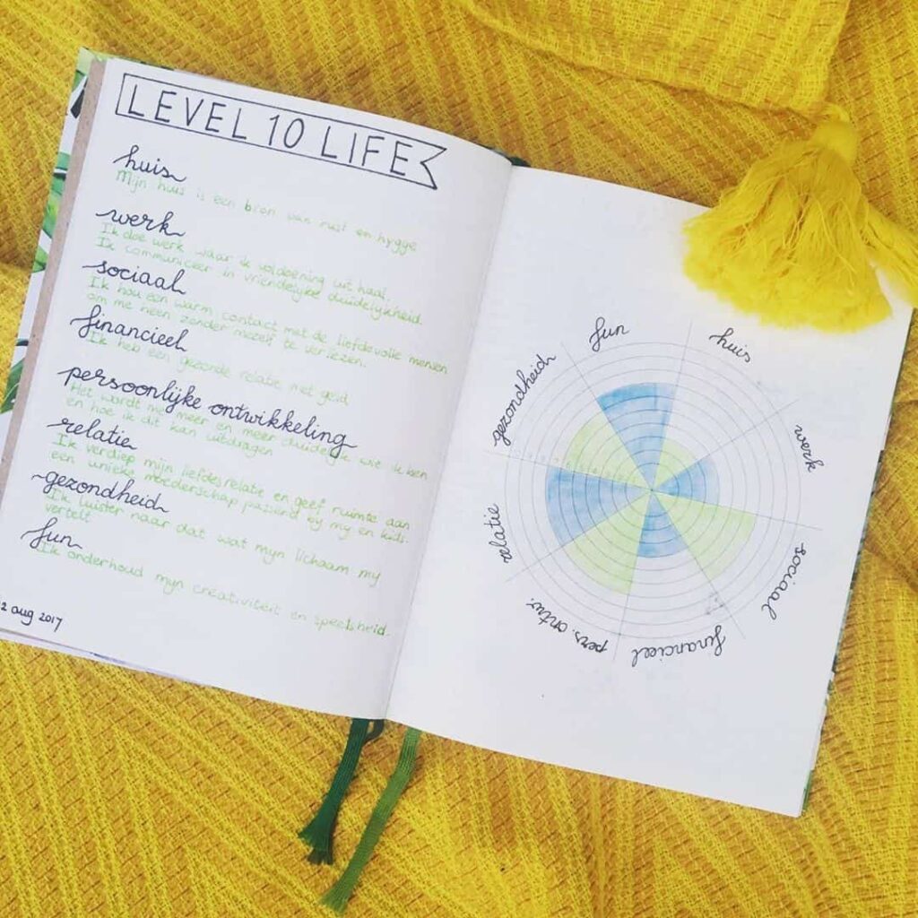
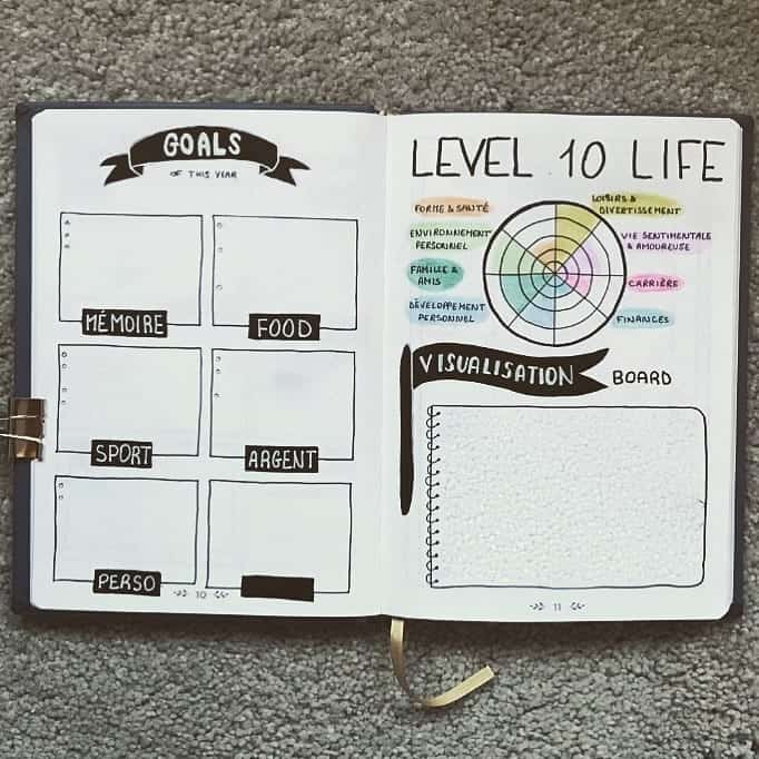
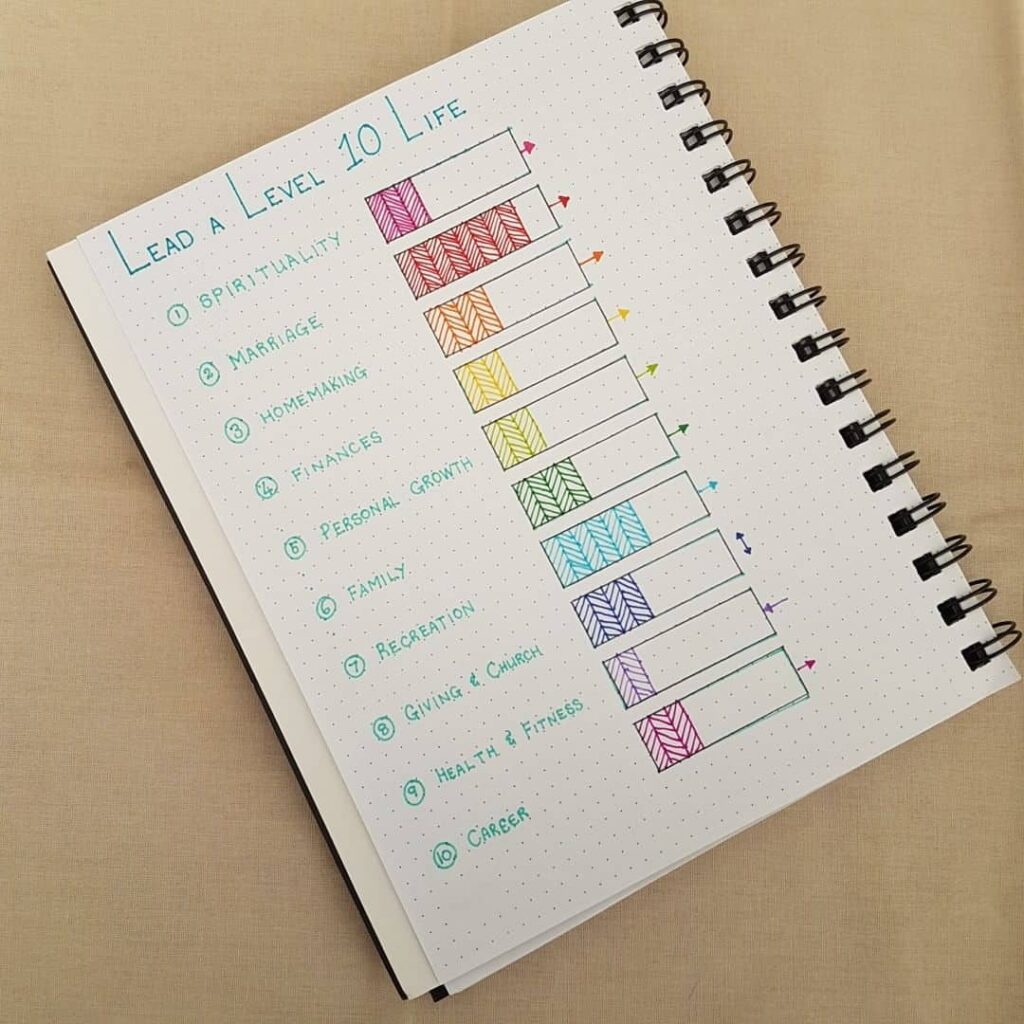
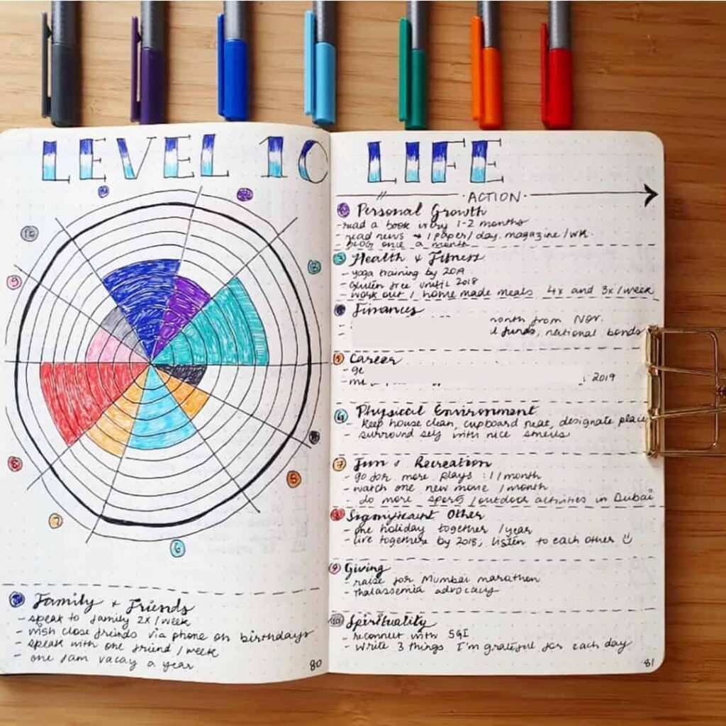
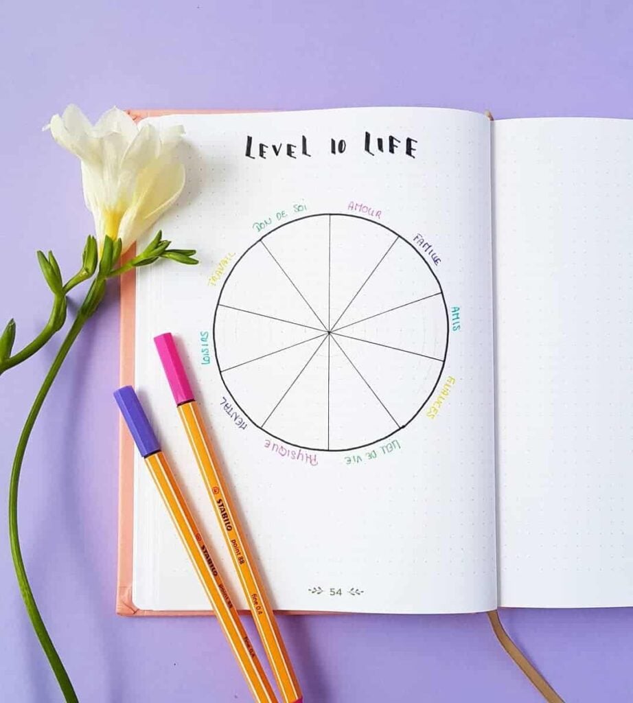
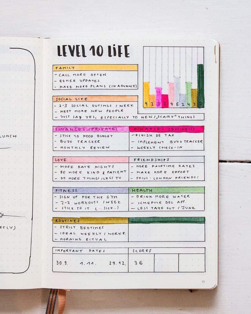
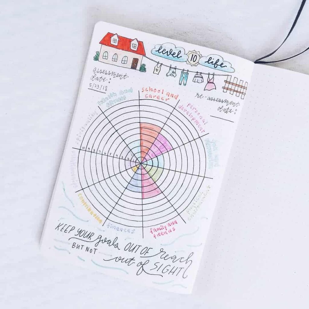
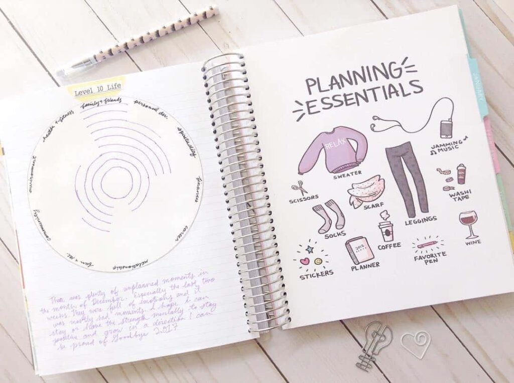
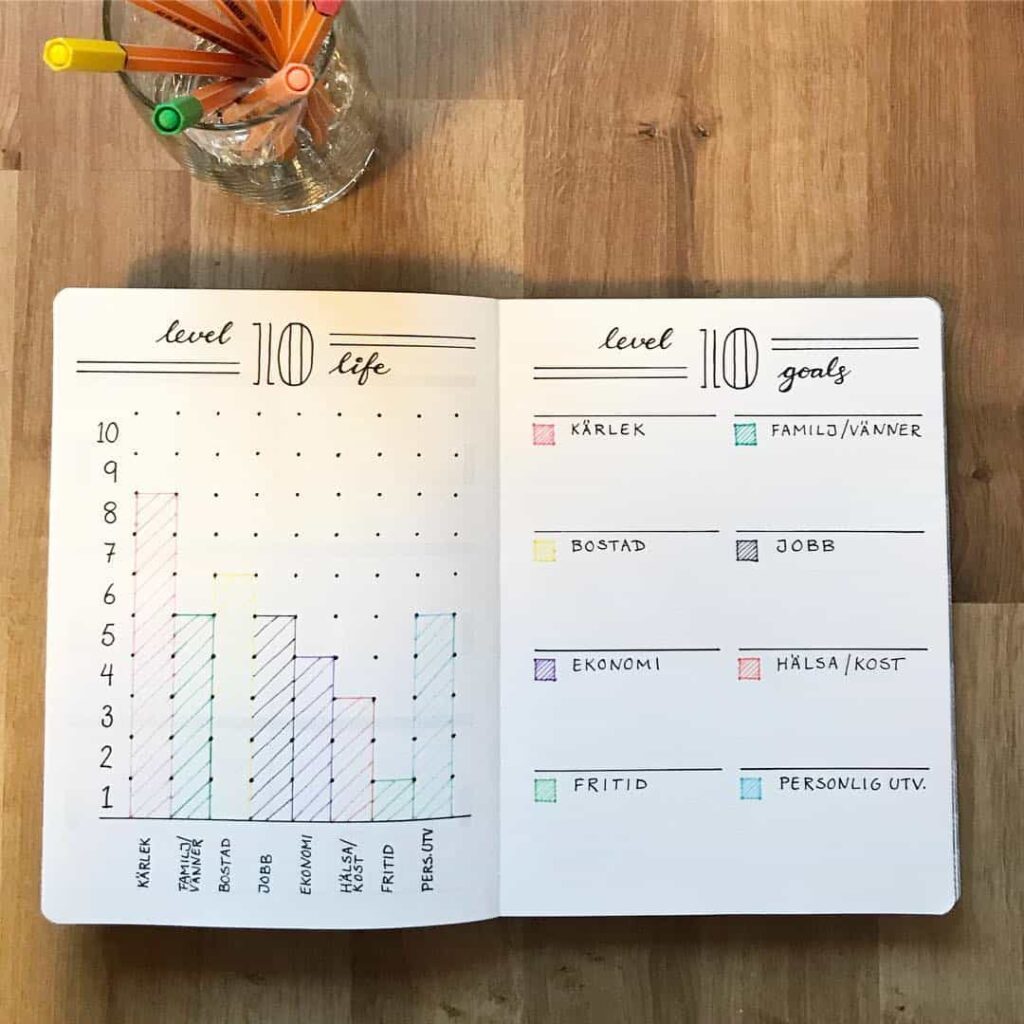
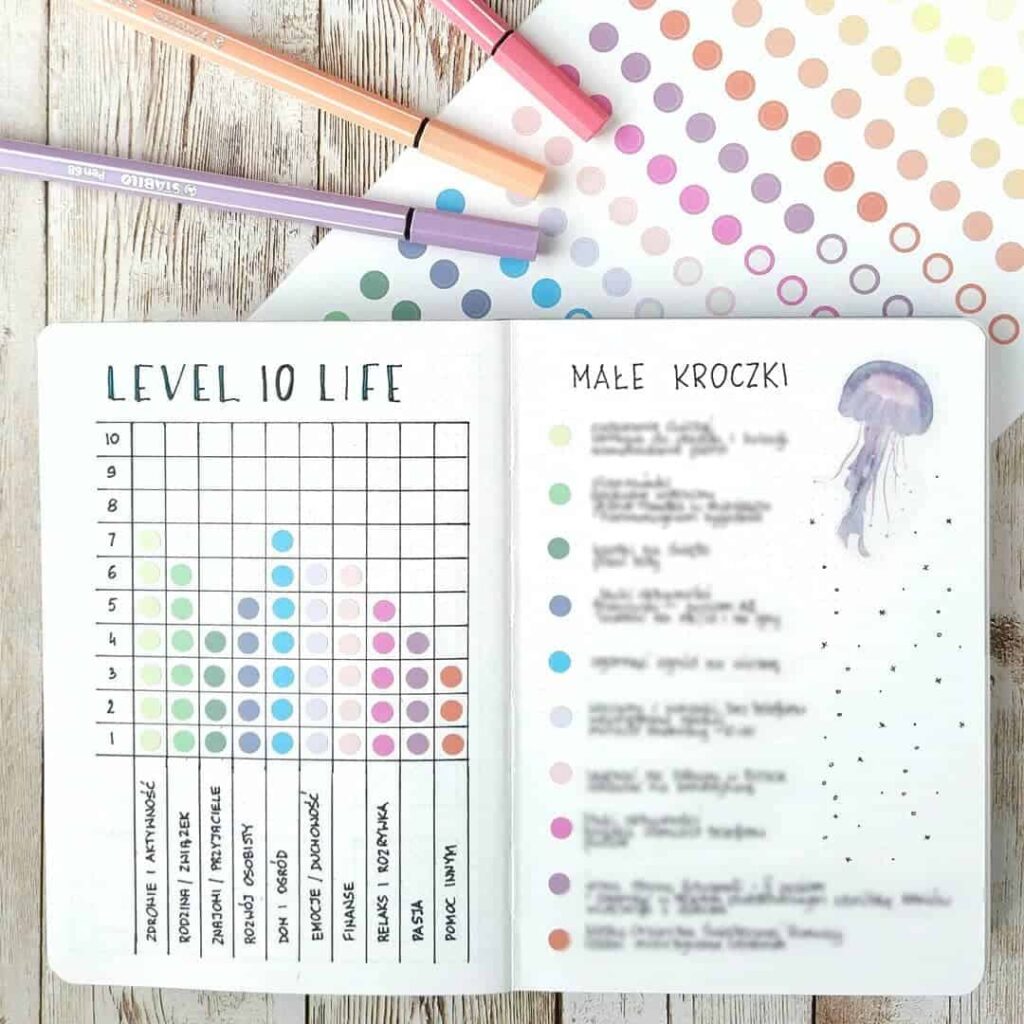
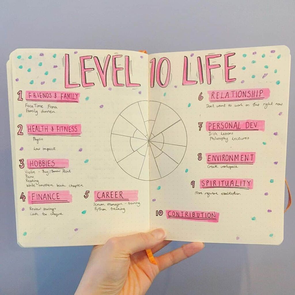
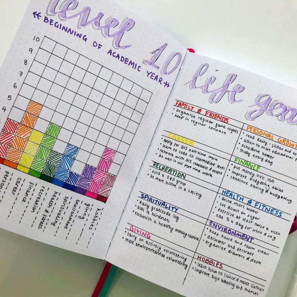
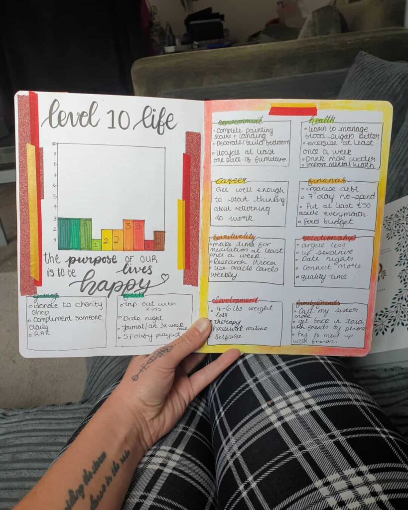
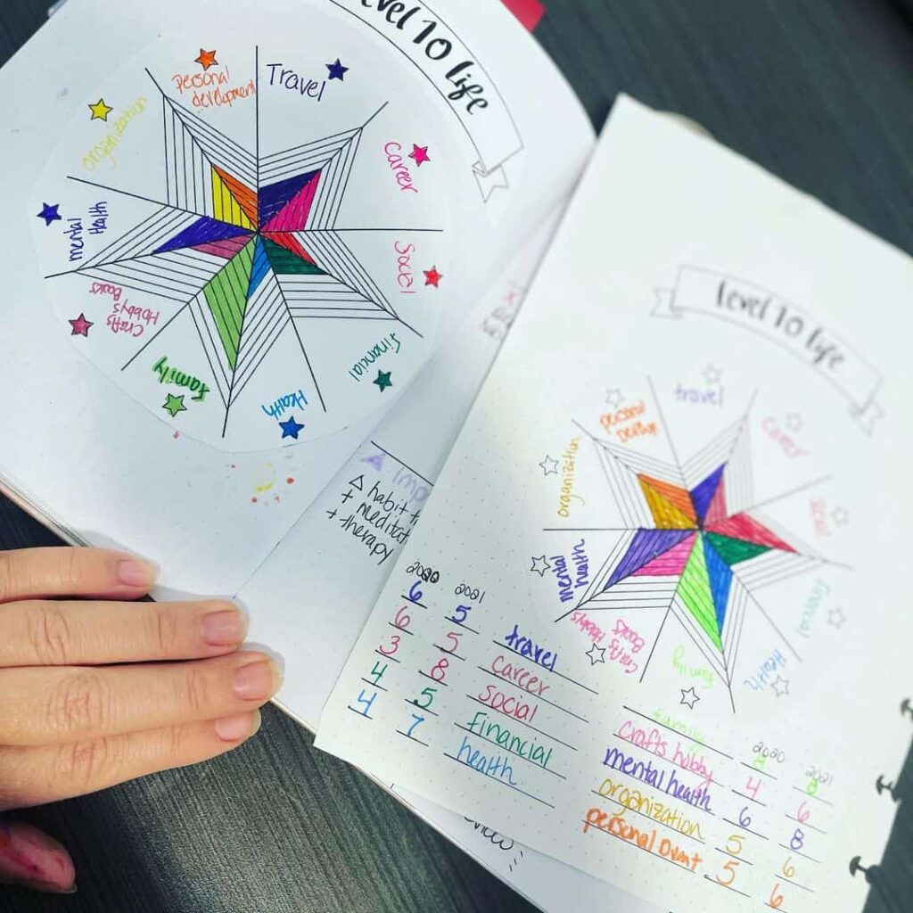
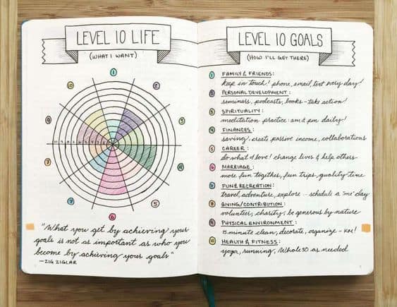
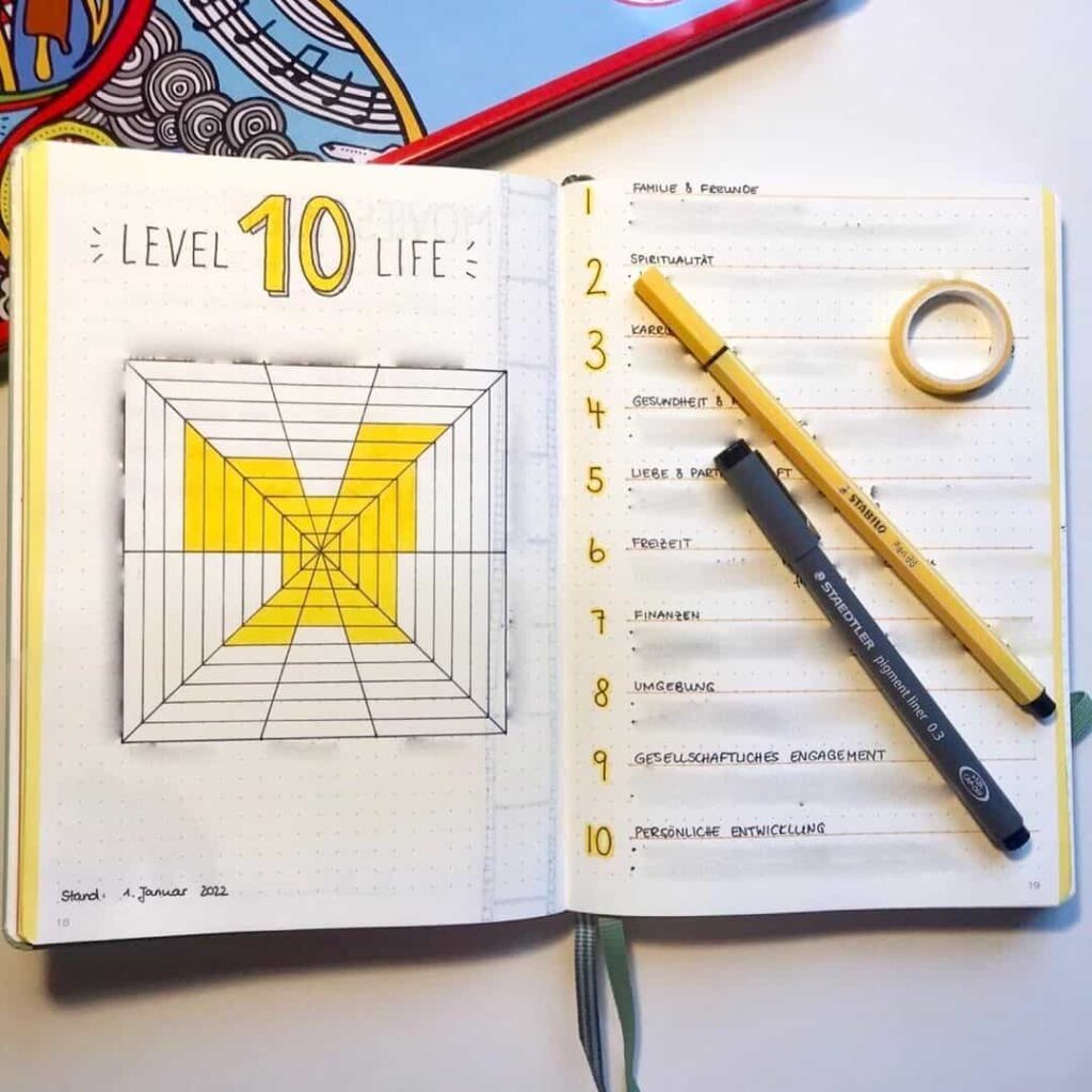
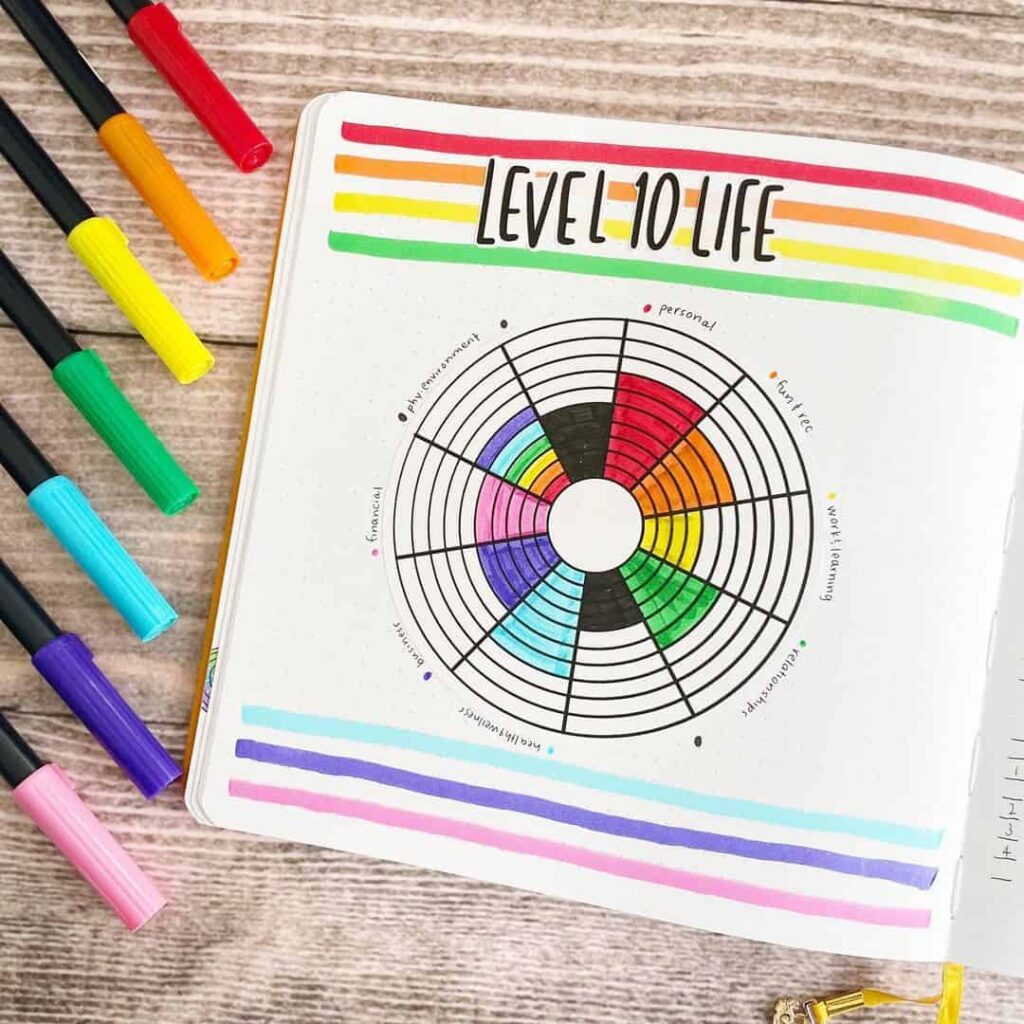
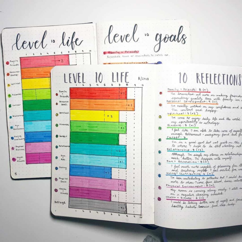
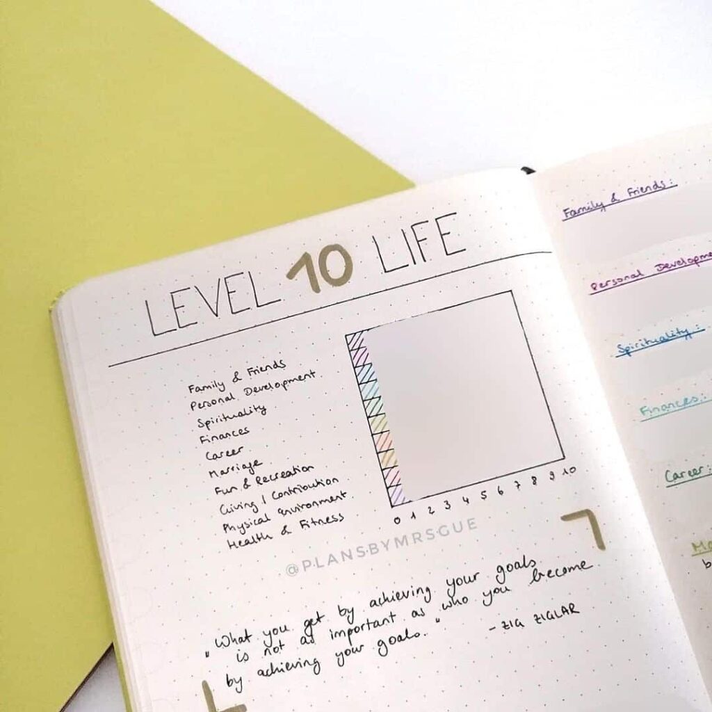
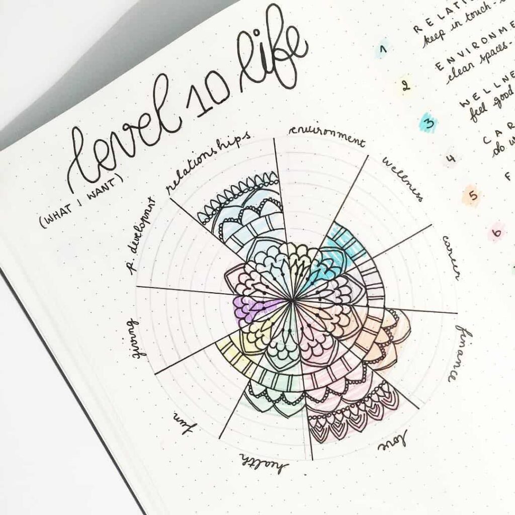
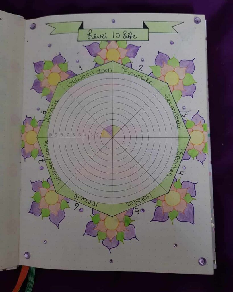
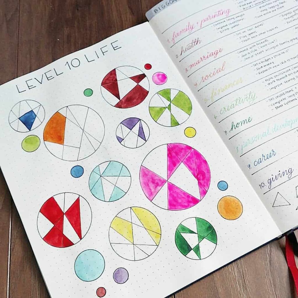
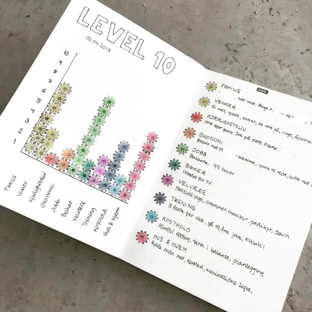
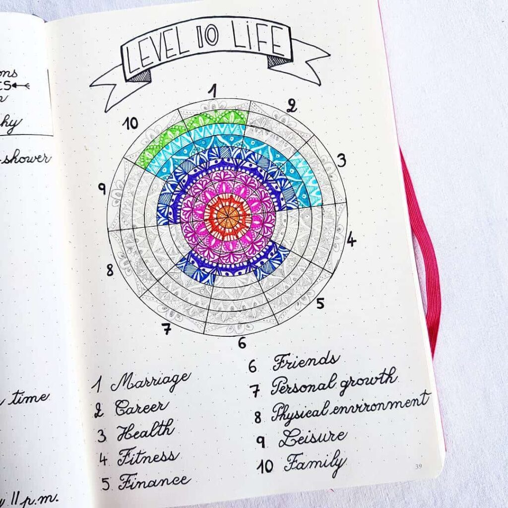
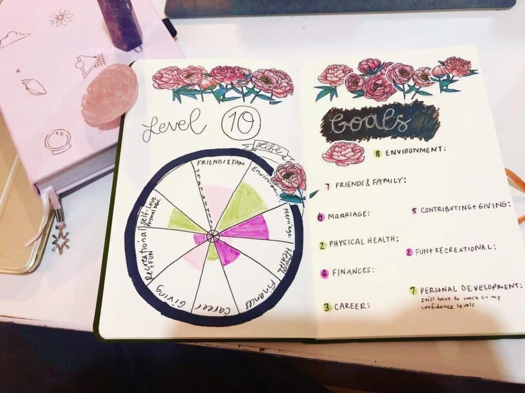
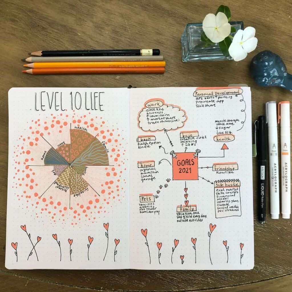
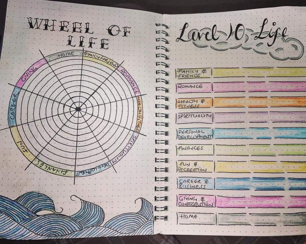
The most common layout is a wheel. The page begins with a circle divided into ten wedges, one per life area, and the circle is then ringed by ten concentric circles numbered one through ten. The journaler shades each wedge inwards from the outer edge to the level that matches their current rating. An area rated four out of ten is shaded only to the fourth ring; an area rated nine is shaded almost all the way out. The finished chart is an uneven wheel, with some wedges reaching close to the outer edge and others stopping short.

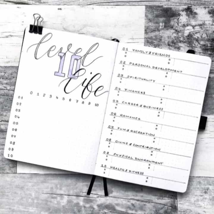
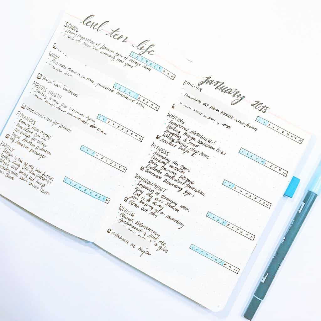
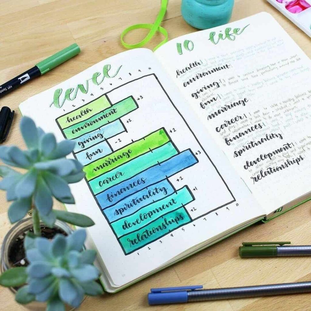
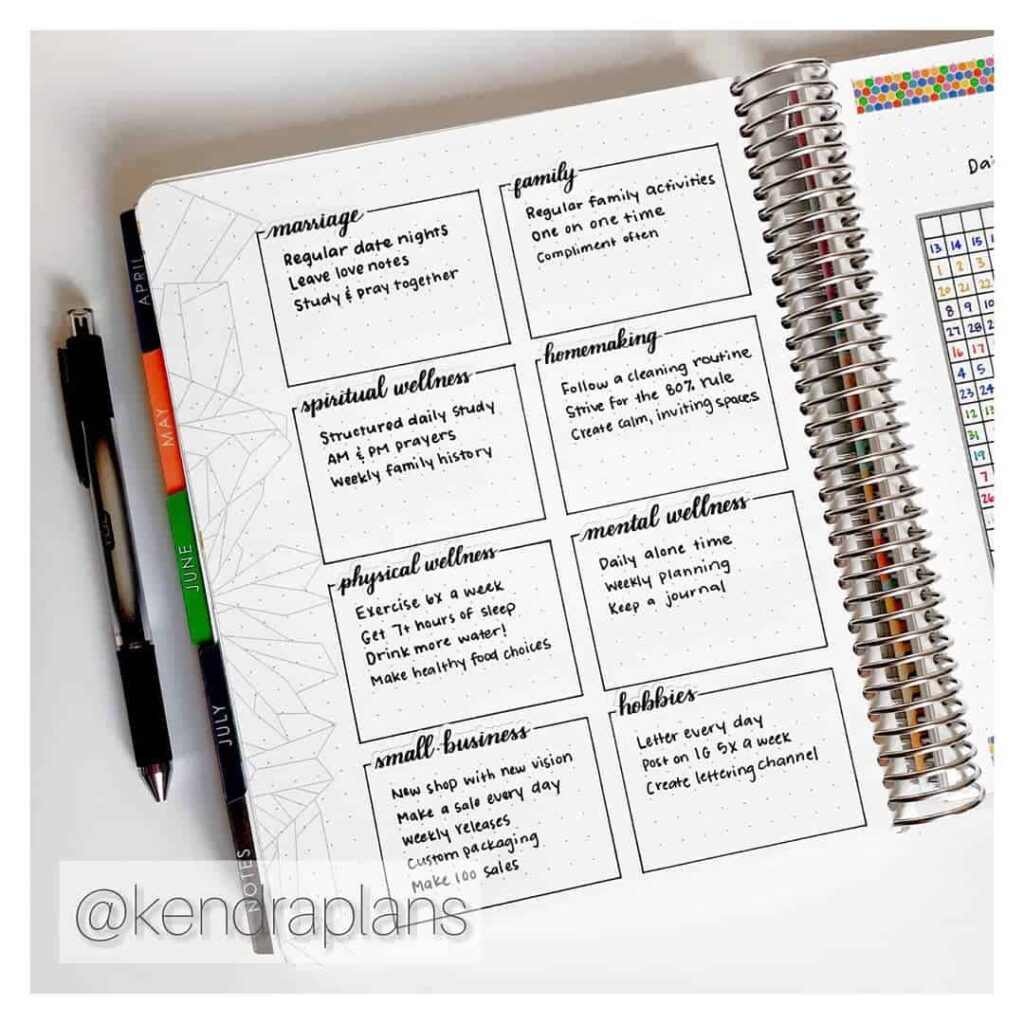
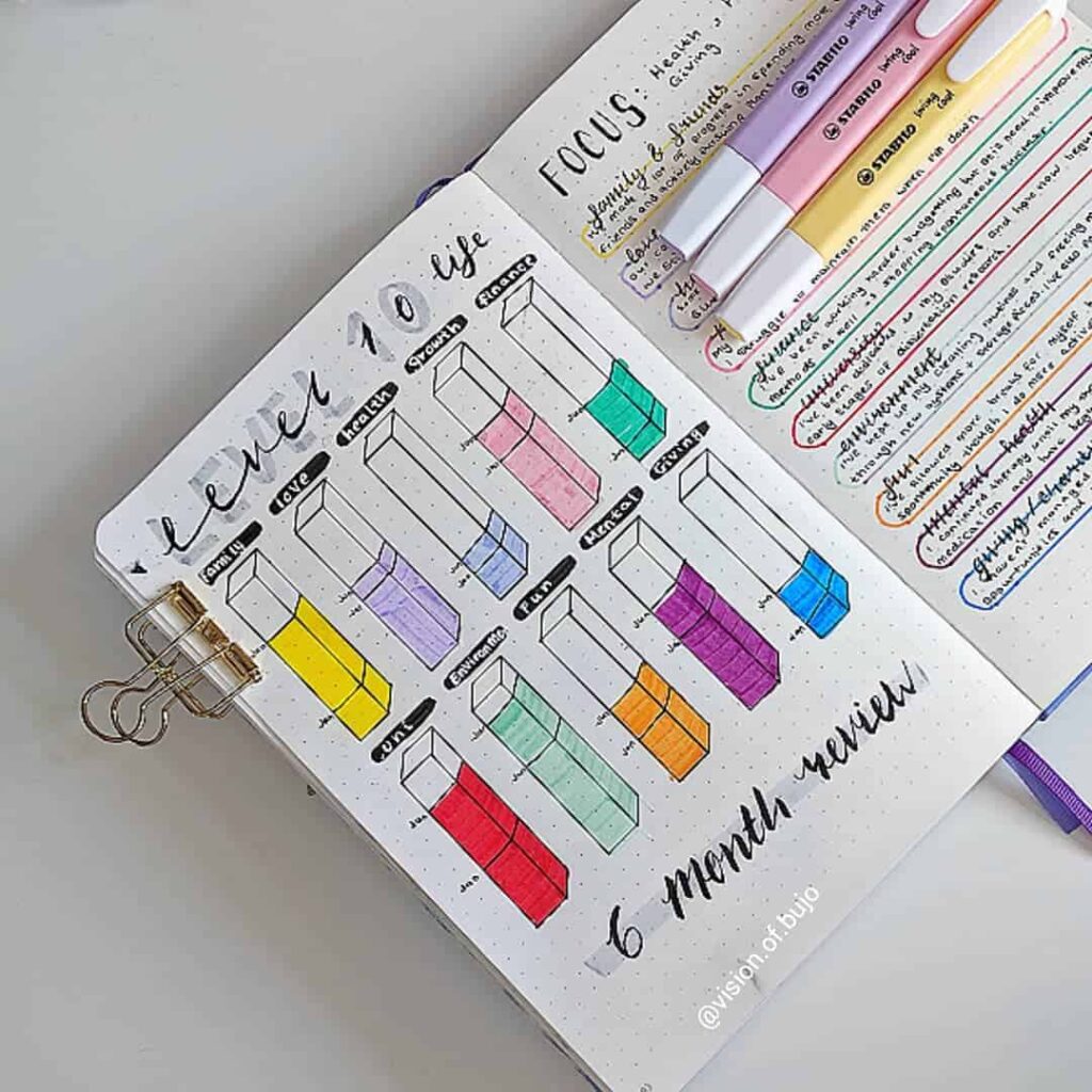
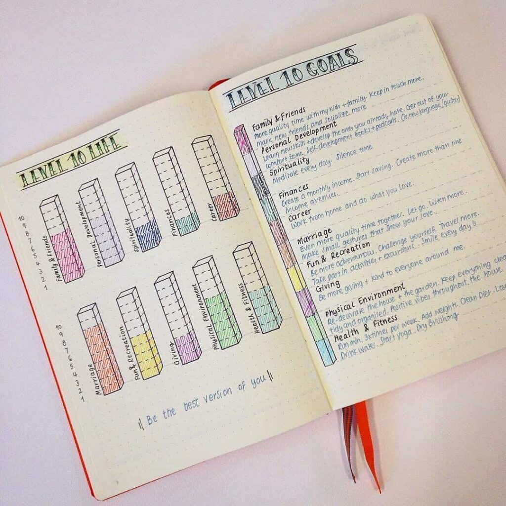
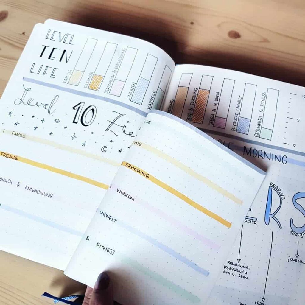
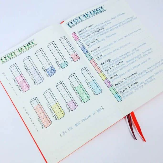
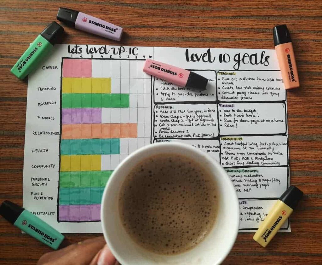
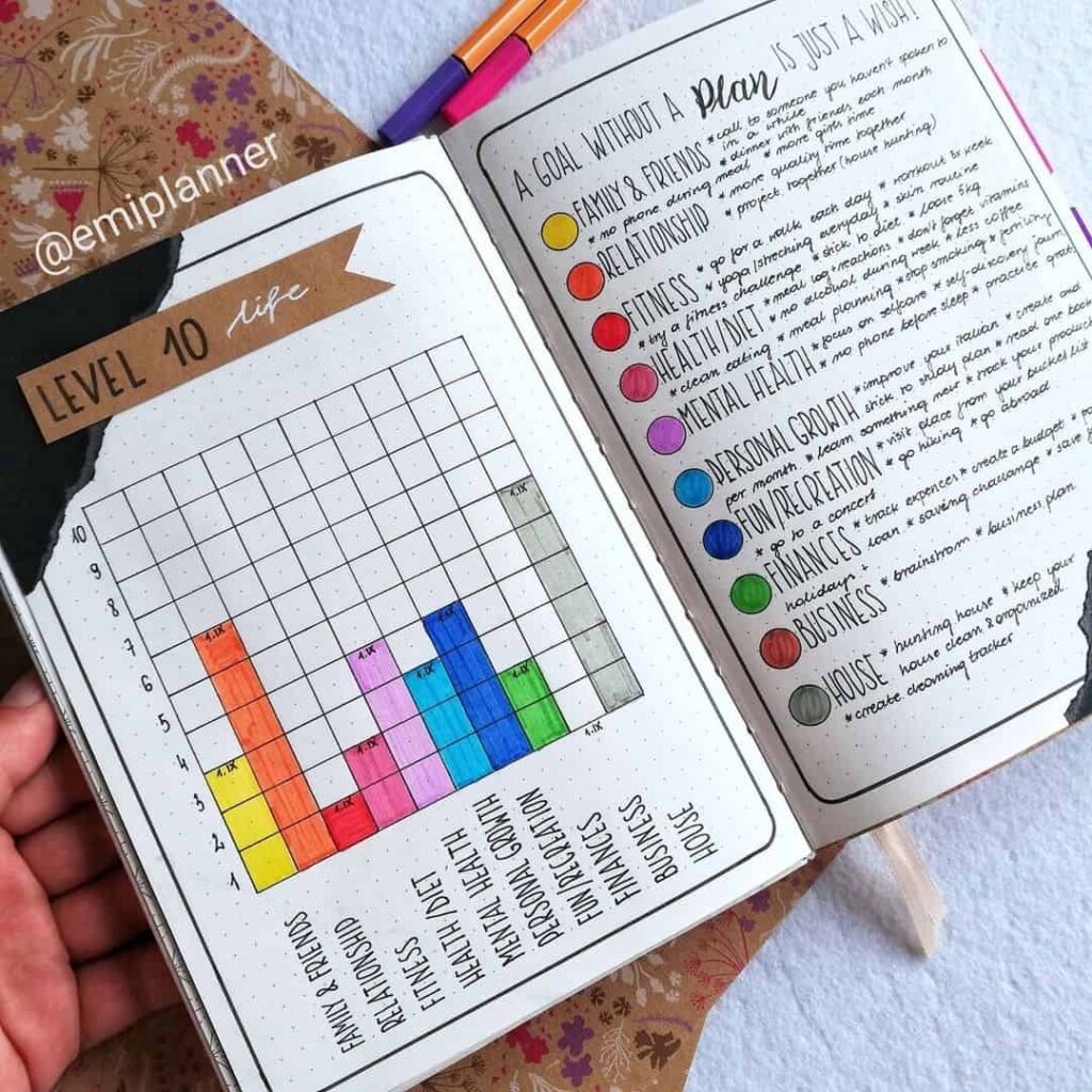
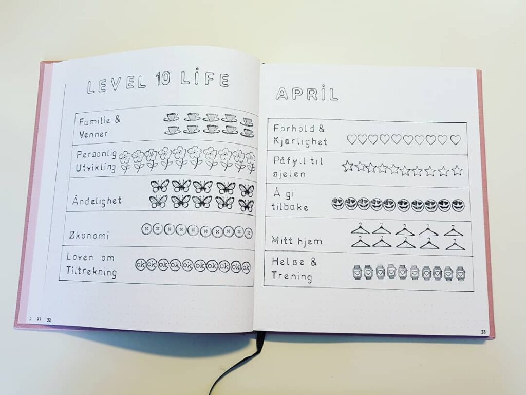
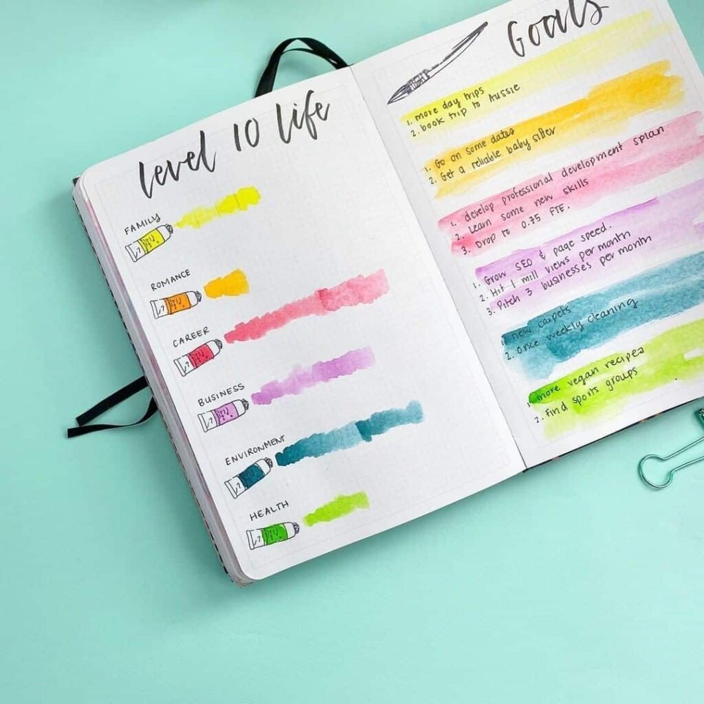
Two simpler variations also appear repeatedly in the gallery. The first is a horizontal bar chart, one bar per category, shaded to the rating. It loses the visual symmetry of the wheel but is easier to compare across months because the bars line up. The second is a plain numbered list with the category, the rating, and a short note about what would raise the rating by one or two points. It is the least decorative format, and the one most often used by journalers who care more about the goal-setting half of the exercise than the chart itself.
Filling the chart in
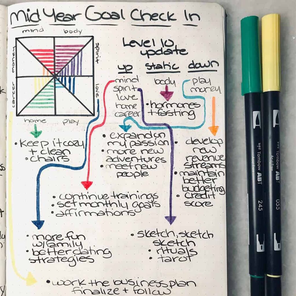
A Level 10 Life is generally drawn fresh every few months — six months is a common interval — rather than updated continuously. The point of the exercise is to capture a moment, and continuous updates tend to smooth out the very contrasts the chart is supposed to make visible. One useful variation is to pair the previous chart with the new one on the same spread — sometimes by overlaying a dotted line on the new chart at the position of the old ratings — so that the change in any one area can be read at a glance.

The rating itself does not need to be precise. The exercise is more useful when the journaler trusts their first impression than when they spend time refining a four into a four-and-a-half. The numbers are a snapshot, not a measurement; their purpose is to surface the areas that have been quietly neglected for a while.
Setting goals from the chart
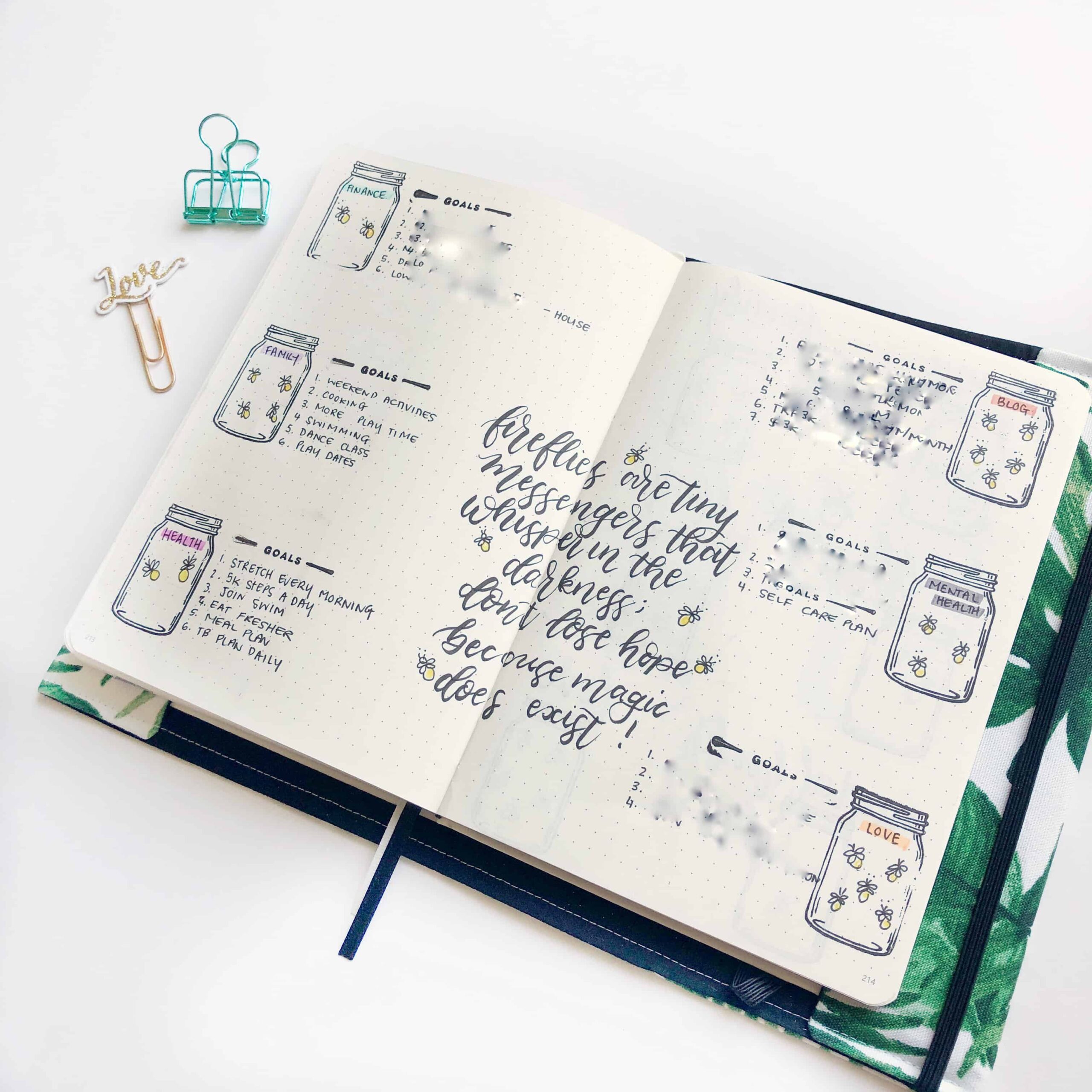
The most useful part of the Level 10 Life is the page that follows the chart. After rating each area, the journaler picks one or two of the lowest-scoring areas and writes down two or three small, concrete actions that would raise the score by a point or two. The smaller the action, the more likely it is to actually be done. A vague goal to “improve fitness” rarely produces a different week; a specific one such as a regular walk on a set day, or a meal plan for the coming week, sometimes does.

Several of the spreads below also include a small list of habits — three or four actions per priority area — rather than goals. Habits and goals overlap, and the spreads in the gallery use one or the other depending on how the journaler thinks about the area they are working on.
Common challenges
Three patterns turn up repeatedly when journalers describe what makes the Level 10 Life harder than it looks on the page. The first is overwhelm — the chart can produce a feeling that every area needs work, which leads to setting too many goals and following through on none of them. The standard answer is to focus on one or two areas at a time and let the rest hold steady until the next chart.
The second is perfectionism, the assumption that an area is unfinished until it is rated a ten. Most areas of most lives sit below a ten most of the time, and that is generally not a problem to be solved — it is simply where life sits. The third is inconsistency, the gap between filling in a chart and acting on it. The chart by itself does very little; the goals page is what does the work, and the chart is most useful as a prompt for that page.
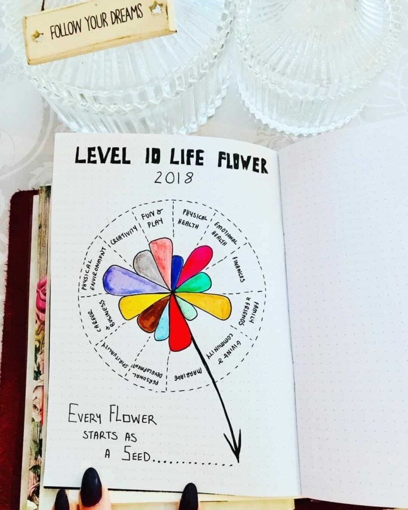
Variations beyond the wheel
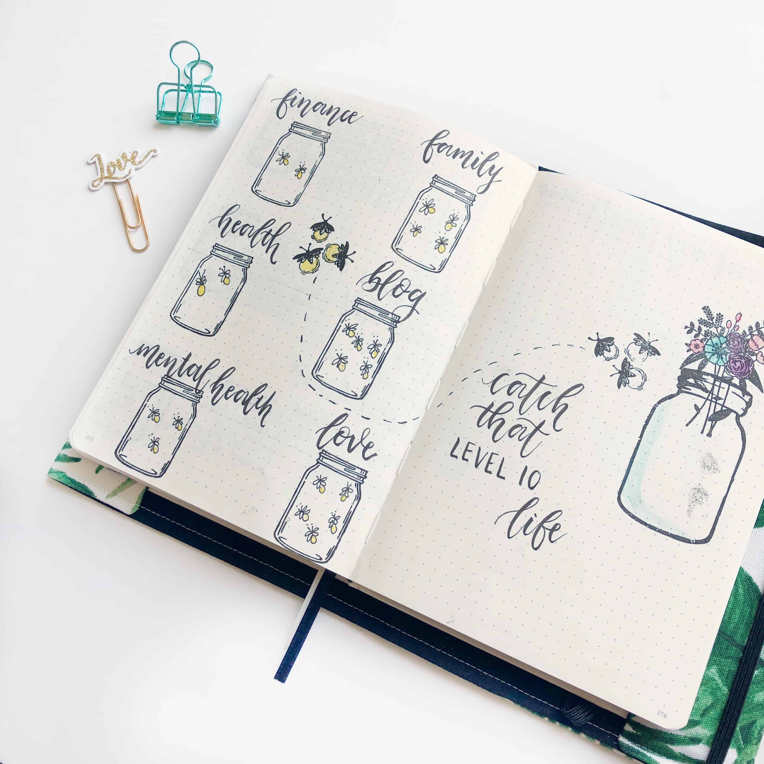
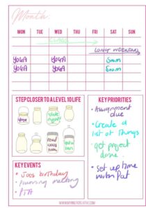
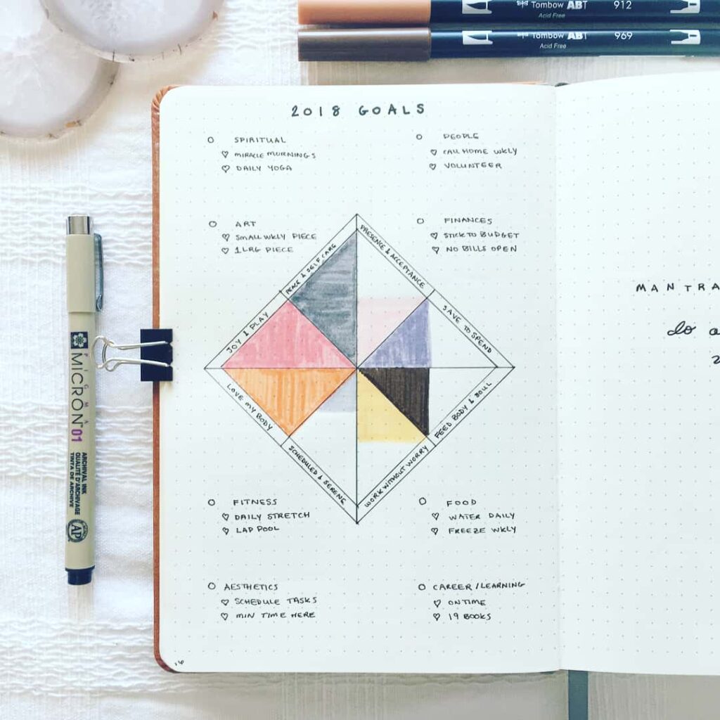
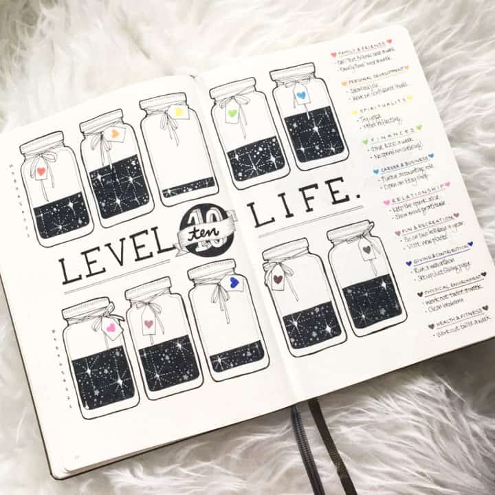
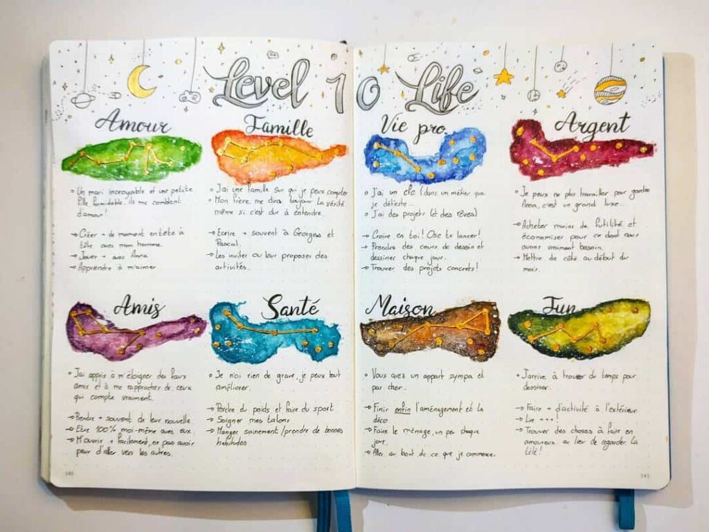
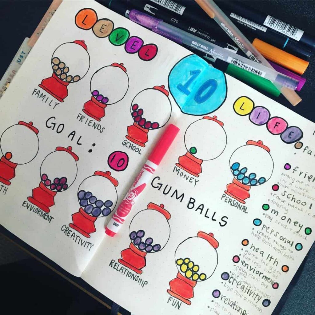
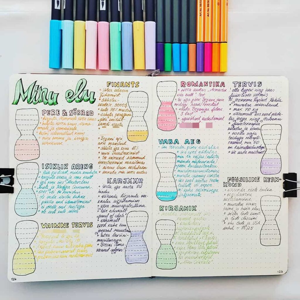
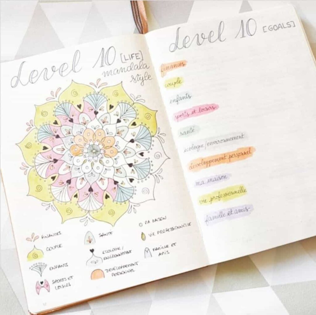
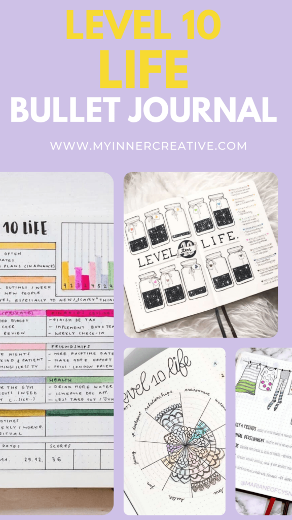
Several of the spreads below replace the standard concentric-circle wheel with a creative metaphor. Mason jars filled with fireflies, gardens with flowers of different heights, ladders with rungs at different points, trees with branches of different lengths, planets in a solar system — the journaler picks an image that matches the rest of the notebook’s theme and uses it to represent the same exercise. The metaphor does not change what the chart measures; it only changes the visual language of how the measurement is recorded.
The creative variations tend to be more time-consuming to draw, which is part of their appeal — the act of drawing the chart is itself a form of attention paid to the areas it depicts. They also tend to be more compelling to revisit later, since the page is a small piece of artwork rather than a chart, which makes the comparison to the next chart a more vivid exercise.
What the gallery is and how to use it
The two galleries below collect Level 10 Life spreads from the My Inner Creative community. They are organised into two groups — traditional wheel layouts and creative alternative layouts — so that a journaler looking for a starting point can quickly identify a format that matches how they already work in their notebook.
The traditional gallery is the more practical reference of the two. Because the wheel layout follows a consistent structure across every spread, the differences between pages come down to execution decisions: how the wedge labels are written (inside the wedge, around the outer edge, or on a legend beside the chart); whether the shading uses solid colour, hatching, or stippling; how much white space surrounds the wheel; and whether the rating scale is marked with numbers, dots, or not labelled at all. Scanning several of these pages alongside each other is a useful way to notice which of these decisions suits a particular notebook’s existing style before committing to drawing the chart.
The creative gallery serves a different purpose. Those spreads are less useful as direct templates — the mason jar, garden, and ladder formats each require their own approach to construction — and more useful as evidence that the underlying exercise does not depend on the wheel format at all. For journalers who find the standard concentric-circle layout at odds with the aesthetic of their notebook, the creative gallery is a reminder that the chart’s function (rate each area, surface the gaps, set goals) can be separated entirely from its most common visual form.
Neither gallery is exhaustive, and the spreads shown represent a range of skill levels and notebook styles rather than a curated selection of the most technically accomplished pages. The intention is breadth of approach, not a showcase of the most refined examples.
A printable version of the Level 10 Life chart is also available as a starting point: download the Level 10 Life printable.
Traditional Level 10 Life layouts
The spreads collected below come from the My Inner Creative community and follow the original concentric-wheel format closely. They are included as a visual reference; any one of them can be redrawn in a notebook with a compass or a circular object and a pen.


How the creative layouts work as an alternative
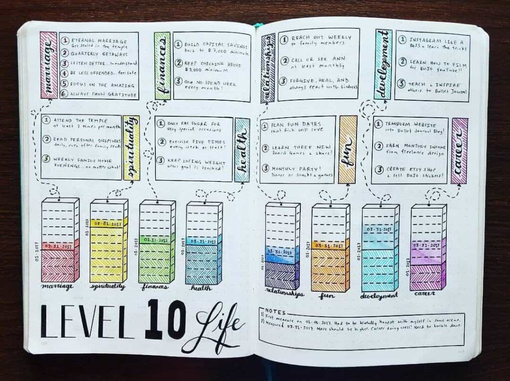
The spreads in the creative gallery below all perform the same rating exercise as the wheel — each life area gets a score, the scores are represented visually, and the finished page is revisited later to compare against a new chart — but the visual language is entirely different. Instead of a circle divided into wedges, the journaler picks a container metaphor: a mason jar filled to different levels, a garden with flowers of different heights, a ladder with rungs reached at different points, a row of planets of different sizes, a tree with branches of different lengths. The life areas become the named parts of that metaphor, and the rating becomes a physical property of the element — how full, how tall, how far up.
These layouts involve a meaningful amount of additional drawing time compared to the standard wheel. That is part of their function. The act of drawing the chart slowly — filling in the mason jar incrementally, adding petals to a flower — creates a form of attention to each life area that a quickly shaded wedge does not. Journalers who use creative layouts often report that the drawing process itself surfaces observations about an area that the number alone would not have.
There are practical trade-offs. Creative layouts are harder to redraw at a consistent scale across multiple charts, which makes side-by-side comparison between two time periods more difficult than it is with the standard wheel. They also take longer to set up, which matters for journalers who fill in their chart on a time constraint. The creative format tends to suit journalers who treat the drawing of the chart as a separate, deliberate practice rather than a quick periodic check-in.
The spreads below include both fully illustrated versions — where the metaphor is drawn in detail — and simpler interpretations where the creative element is gestural rather than elaborate. Both approaches use the same metaphor structure; the difference is in how much time the journaler has invested in the visual execution.
Creative Level 10 Life layouts
The spreads below take a more decorative approach to the same exercise, replacing the standard wheel with mason jars, gardens, planets, ladders, and other visual metaphors that match the theme of the notebook they sit in. The underlying rating exercise is the same in each.


The Level 10 Life chart does almost none of its work on the day it is drawn. The chart is finished in an hour or less, and the page itself is small. What turns the exercise into something useful is the page that follows it, where the lowest-scoring areas are matched with a small set of concrete actions, and the slower work of revisiting the chart six months later to see what shifted and what did not. On most charts most of the wedges stay roughly where they were, and that is itself useful information — the areas that change are usually the ones the journaler has been paying attention to, and the comparison from one chart to the next is the part of the practice that most often turns out to have been worth keeping.