Editorial note: This article was originally published on My Inner Creative and has been updated and republished in May 2026 under The Vessel’s editorial standards.
A themed bullet journal takes a notebook that is mostly being used for a small set of practical purposes — tracking habits, planning the week, listing tasks — and threads a single visual theme through every page of it. The format does not change. The colour palette, the headers, the icons in the margins, and the doodles in the corners do. Several themes have been popular in the bullet-journal community over the years; the Harry Potter books are one of the longest-running.
The spreads collected below were originally featured on My Inner Creative as a survey of how journalers have used motifs from the Harry Potter series to decorate the practical pages of a bullet journal. They include cover pages, habit trackers, monthly spreads, reading logs, and a handful of larger illustrated pages, all of which use the same underlying formats found in any other bullet journal. The theme is the visual layer; the structure underneath is the same.
Why themed bullet journals
A practical reason and a less-practical reason tend to come up together. The practical one is that a notebook with a consistent visual identity is easier to come back to, day after day, because the page recognises the journaler before the journaler has to recognise the page. The less-practical one is that the act of drawing the theme is itself a small piece of unhurried time, the kind that gets harder to find in a busy week.
Themed spreads, by their nature, are not the most efficient way to keep a habit tracker or a monthly log. They take longer to draw than a plain ruled page would. What they do offer is a notebook that the journaler is more likely to actually open. A spread that has been drawn with care holds attention; a spread that is purely functional often does not. For the kind of work bullet journals are supposed to support — the small repeated entries that only matter if they actually get written down — that extra attention is part of the practice.
How to start your own Harry Potter spread
The threshold for starting is lower than most journalers expect. You do not need calligraphy skills, a large supply collection, or an art background. The spreads in this gallery were made with ordinary supplies and a willingness to copy simple shapes.
Pick one house palette before you open the notebook. Choose a single house and buy two fineliners in those colours. Starting with one palette keeps pages consistent and removes every colour decision when you sit down to draw.
Choose three icons and practise them first. A wand, a pair of glasses, and a lightning bolt are enough to theme any page. Draw each one ten times on scrap paper before opening the notebook. The icons in this gallery are almost all line work; none of them require careful drawing to be recognisable.
Start with the cover page only. Draw a single themed cover before committing to anything else. A cover page is low stakes — it does not need to be functional — and finishing one makes the rest of the notebook feel possible. The most common reason journalers abandon a themed notebook is the first spread: it takes longer than expected, does not look the way they imagined, and the gap between that page and every other page in the notebook feels too large. Drawing the cover on a loose sheet of paper first removes that pressure.
Add the theme last, not first. Rule the page in pencil first. Draw your habit grid or weekly layout in plain lines, then add the header treatment and margin icons on top. Theming a finished structure is faster and less risky than building a structure inside a theme.

The visual vocabulary
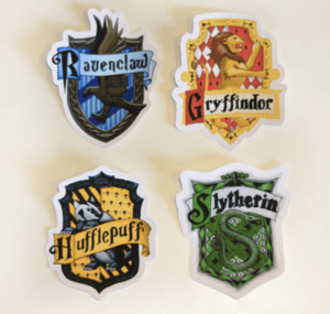
The Harry Potter theme has a more developed visual vocabulary than most. Four house colour palettes are recognisable on sight to anyone who has read the books — the deep red and gold associated with one house, the green and silver with another, the blue and bronze with a third, the yellow and black with the fourth. Several of the spreads below use those palettes as a complete colour-coding system, with one house assigned to a category of work and the palette running through every page that touches that category.
Beyond the house colours, a small set of icons appears repeatedly in the gallery: wands, scrolls, a lightning shape, a stag silhouette, a pair of round glasses, an owl, a key with wings, a small castle outline, candle flames, a wax-sealed envelope, the silhouette of a snitch. None of these need careful drawing to be recognisable; most of them are line work that any journaler can copy. The theme is forgiving in that way. A handful of small icons drawn in the margin of a page is enough to mark it as part of the same notebook, and the icons themselves are forgiving — a wavy line reads as a wand, two small circles as a pair of glasses.
What supplies you actually need
A Harry Potter themed bullet journal does not require specialist supplies. The icon vocabulary is almost entirely line work, which means a fine-tipped black pen and one or two coloured pens are enough to reproduce any of the formats in this gallery.
A dotted or blank notebook is preferable to one with a printed grid. Grid lines compete with hand-drawn elements. Dotted paper gives alignment guides without dominating the page.
One black 0.4mm fineliner handles all line work, lettering, and icons. Pigment ink dries without smearing and photographs clearly if the journaler shares spreads online. Two coloured brush pens — one for fills, one for headers — complete the minimum kit. Choose from the house palette. Brush pens blend where they overlap, which makes headers easier to shade without additional supplies.
Two additions make a significant difference without adding much cost. A white gel pen is used for star details, highlight dots on icons, and corrections on dark fills; it adds more visual depth than almost any other single supply. A ruler and pencil are used to rule the underlying structure of every functional page — the habit grid, the monthly calendar, the reading log — before the ink goes down. The pencil lines are erased once the ink is dry.
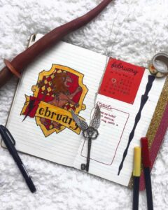
House palettes are the most important supply decision. The Gryffindor palette requires a deep red and a warm gold. Slytherin uses a forest green and a cool silver-grey. Ravenclaw takes a medium blue and a bronze-brown. Hufflepuff pairs a warm yellow with a dark charcoal. Each combination produces a distinct page feel, and journalers who commit to one palette for an entire notebook find the pages more coherent than those who mix palettes across spreads.
What the pages actually do
Most of the spreads below are the same practical formats found in any bullet journal. Monthly calendars, weekly logs, daily layouts, reading trackers, habit grids, and gratitude pages all appear. The theme adds a header treatment — Hogwarts-style lettering, a wax seal in the corner, a banner across the top of the page — and a colour palette, and otherwise leaves the underlying format intact. The structural decisions that make a habit tracker easy to use on a Wednesday morning are the same whether the page is decorated with cauldrons or with houseplants; the theme rides on top of those decisions rather than replacing them.
Common formats in the gallery include reading trackers, quote pages, themed habit grids, and the occasional larger illustrated overview spread. The novelty of these formats is mostly visual; the practical pages remain the practical pages, and the spreads work because the layouts underneath them work.
How the theme adapts to each format
Every format in the gallery below is a standard bullet journal layout dressed in Harry Potter visual language. The underlying structure does not change; the theme sits on top of it. Understanding the translation makes it easier to choose which spread to draw first.
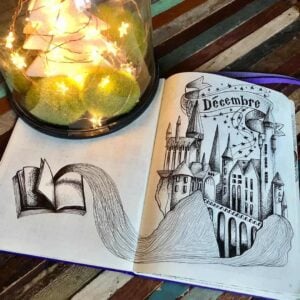
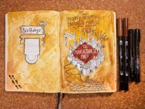
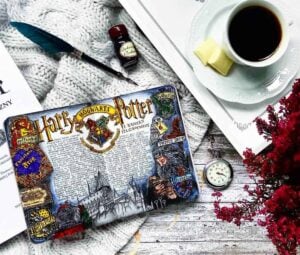
Cover pages are the easiest entry point. A title, a date, and a decorative illustration are all that is required. A Hogwarts castle silhouette or a house crest fills the page without requiring precise line work, and the spread has no functional content to get right.
Habit trackers are the format most affected by house colours. The grid itself — rows of habits, columns of days, each cell filled or left empty — is identical to any other bullet journal. The house palette becomes the fill colour, applied one house per habit category or one house per week of the month. The colour does the decorative work; the icon work in the header and margins can be minimal.
Monthly spreads use themed elements as functional markers. A wax seal or house banner anchors the header. Small icons — owls, winged keys, candle flames — serve as event markers in place of plain bullets, so the decoration is built into the way the page is used rather than added around the outside of it.
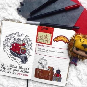
Weekly logs use the theme in the day headers. Hogwarts-style lettering for each day name, and a small themed icon in the corner of each day section, ties the pages together with minimal drawing time per spread. The icon can be the same one repeated across all seven days; consistency matters more than variety.
Reading logs and quote pages tend to be the most rewarding formats for journalers who are new to the theme. The reading log is functional and structured — title, author, dates, a short rating — and the Harry Potter books themselves often appear as the first logged entries. The quote page has no blank space to fill beyond the illustration border, and the Mirror of Erised quote is the most common choice. Neither format requires the journaler to plan a layout from scratch.

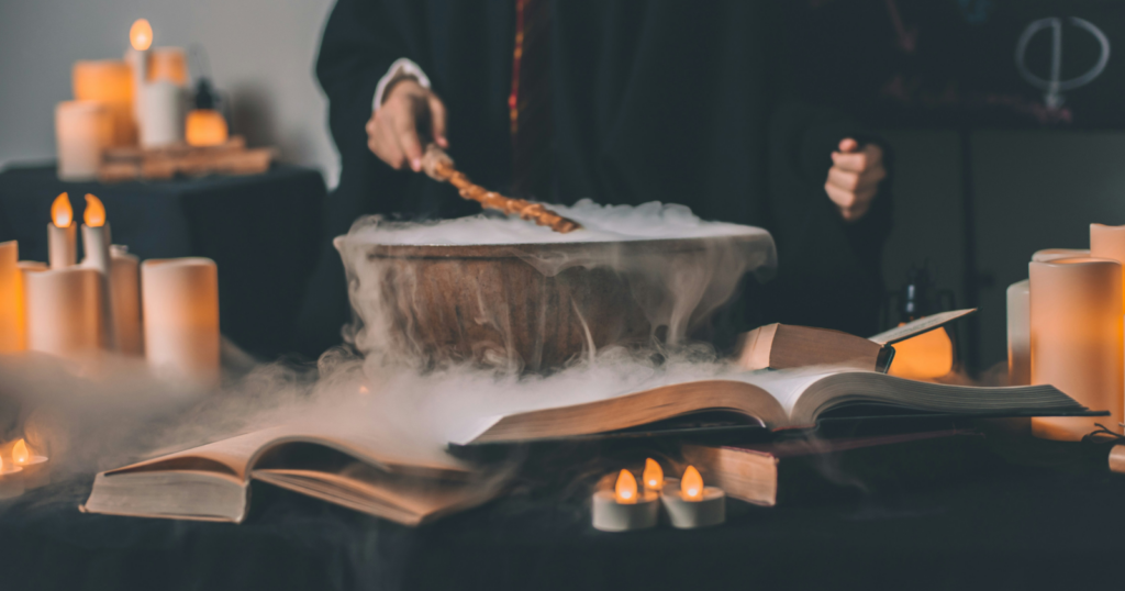
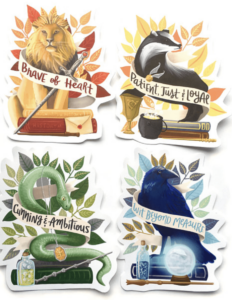
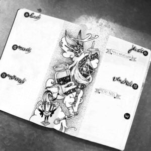
Featured Harry Potter bullet journal spreads
The spreads collected below come from the My Inner Creative community and span cover pages, monthly and weekly layouts, habit trackers, reading logs, and several larger illustrated pages. They are included as a visual reference. Any one of them can be redrawn with a pen, a small set of coloured fineliners, and whichever house palette the journaler is drawn to.


A themed bullet journal lives or dies by the time the journaler spends with it, and the theme is most useful when it makes that time feel less like a chore. The pages above are not more practical than a plain ruled spread would be. They are not more efficient either. What they are is more inviting, page after page, on a Sunday evening or a Tuesday morning when the alternative is to skip the notebook entirely. For the journalers whose pages appear above, that has been enough to keep the practice going.