
Editorial note: This article was originally published on My Inner Creative and has been updated and republished in May 2026 under The Vessel’s editorial standards.
Minimalist bullet journaling is one of the more durable answers to the question of how to keep a notebook without the notebook becoming a project of its own. Ornate spreads can be slow to design; a minimalist spread can be drawn quickly and used for the rest of the week. The aesthetic is austere by choice, not by limitation: simple grids, clean lines, neat hand-printed labels, and very little colour.
The sixty-five spreads collected below were originally featured on My Inner Creative as a survey of how broadly the same essentially simple aesthetic can be applied. Some use a single colour of ink across the page; others add one accent shade for headings or trackers. Most use ruled lines and printed letters rather than hand-lettered headers. None of them require more than a fine-liner pen and a few minutes of careful attention to set up.


What minimalist bullet journaling actually is
Minimalist bullet journaling is a streamlined version of the traditional bullet journal method. It focuses on essential elements and removes most decorative embellishments. Three principles tend to define the approach:
- Simplicity: straightforward layouts, uncluttered designs, and a limited colour palette. The emphasis is on clear, easy-to-read pages rather than visually elaborate ones.
- Functionality: each spread is designed to serve its intended purpose well. The layout supports usability and structure, and the page works for the person using it rather than the other way around.
- Aesthetics: minimalist spreads do not abandon aesthetics; they simply make them deliberate. Clean lines, balanced composition, and the occasional subtle accent are common, and the result tends to look quietly considered rather than plain.

Practical advantages of a minimalist approach
The case for keeping a bullet journal minimalist is usually less ideological than practical. A few advantages show up reliably in the spreads collected below:
- Time efficiency: eliminating intricate designs means pages can be set up more quickly, which matters in any week where the planning itself starts to feel like a task on the list.
- Clear focus: with fewer visual distractions, the information that matters — tasks, events, goals — is easier to locate and easier to act on.
- Reduced clutter: a clean and uncluttered layout can help create a sense of calm and order, reducing the feeling of overwhelm that a busy page sometimes produces.
- Flexibility: a simple foundation is easy to modify. Minimalist spreads can be adjusted week to week without breaking a visual theme that has to be sustained for months.
None of this is unique to minimalism, and none of it makes minimalism the right approach for everyone. Some people genuinely enjoy the ornate craft side of bullet journaling, and there is nothing wrong with that. The collected spreads here are offered as one valid alternative for the much larger group of journalers who would rather the notebook stay quietly useful in the background.

Common minimalist spread types
The gallery below covers a handful of recurring layouts:
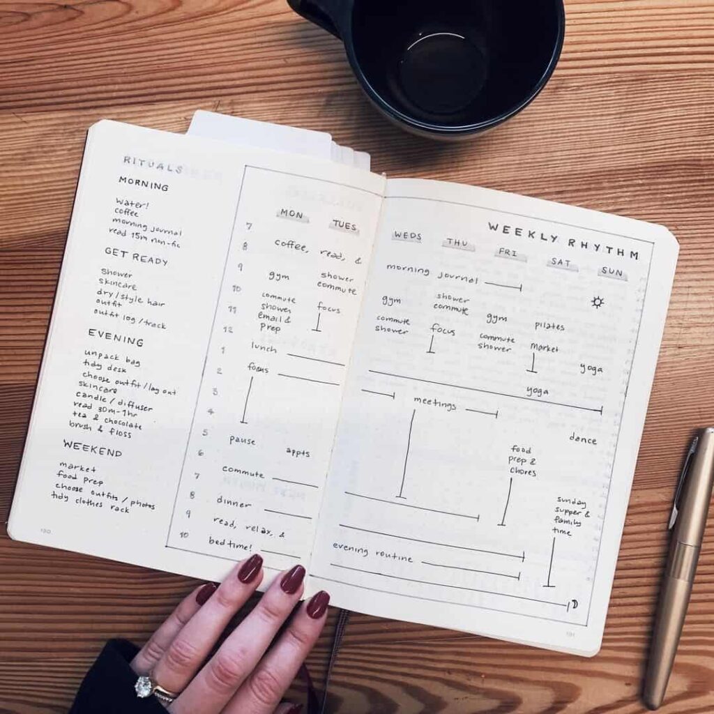
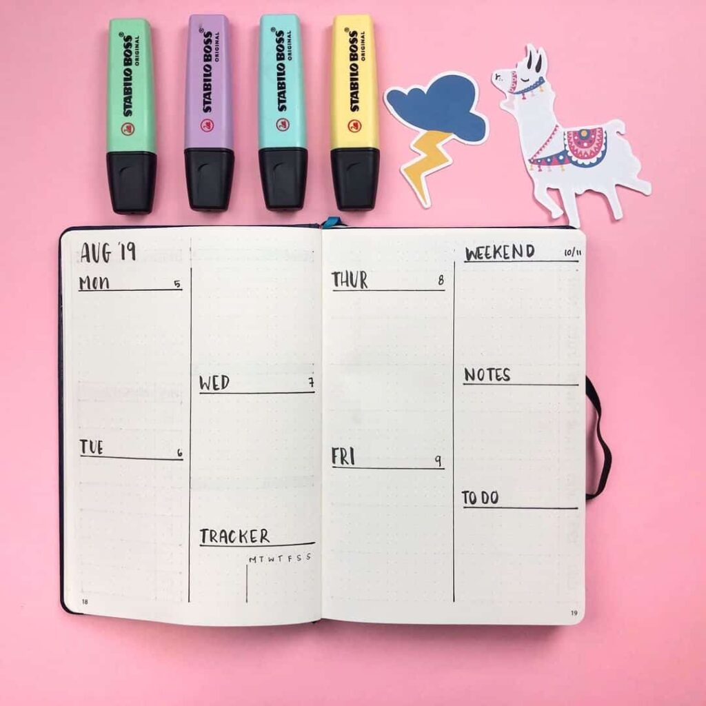
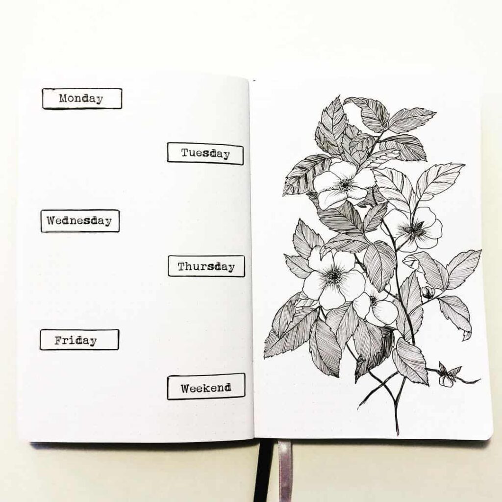
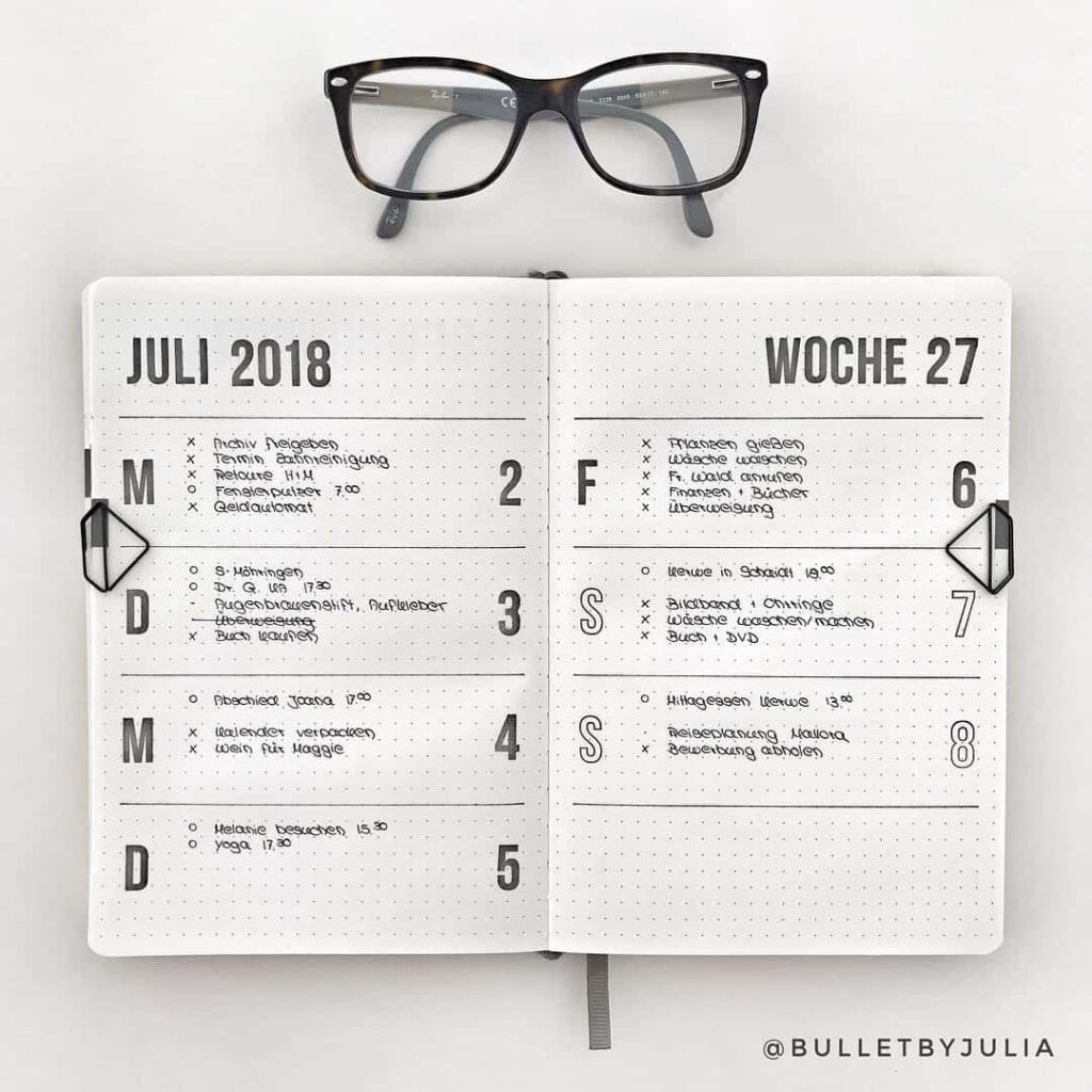
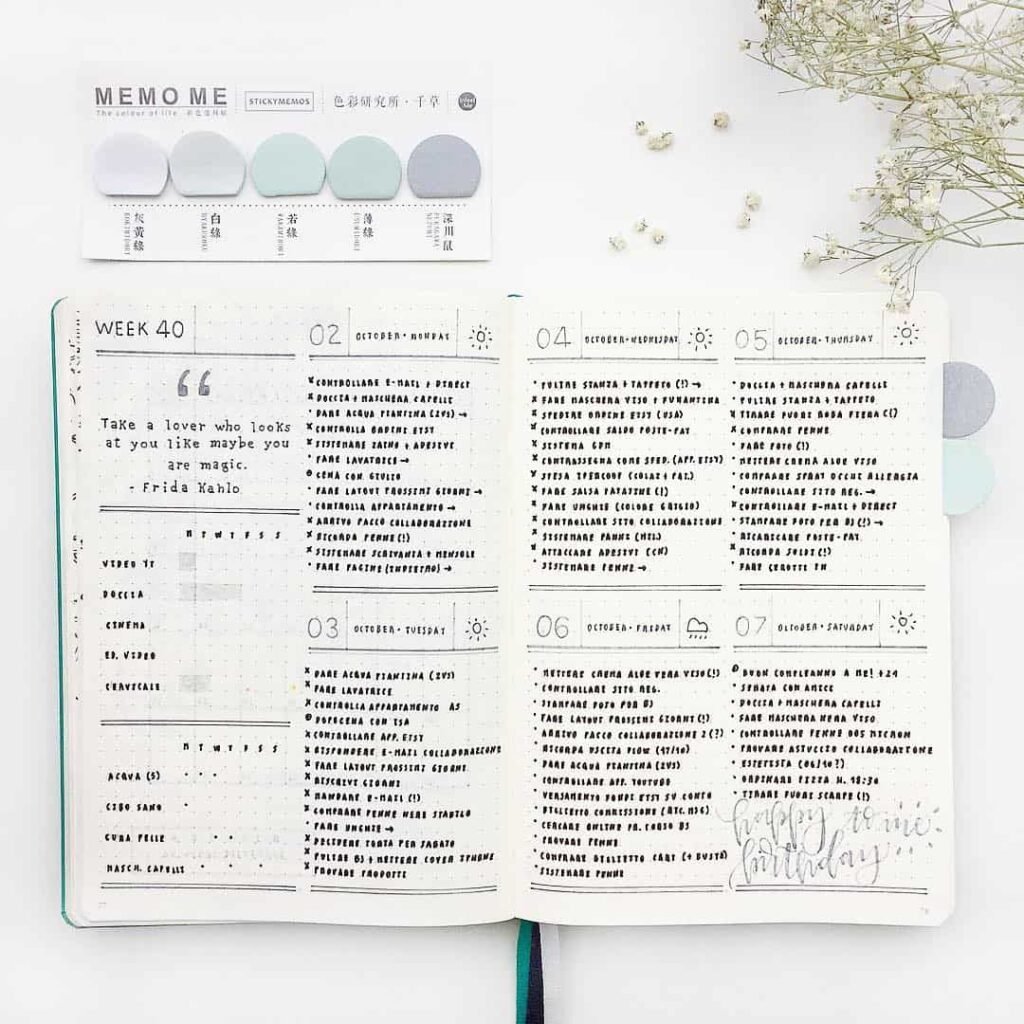
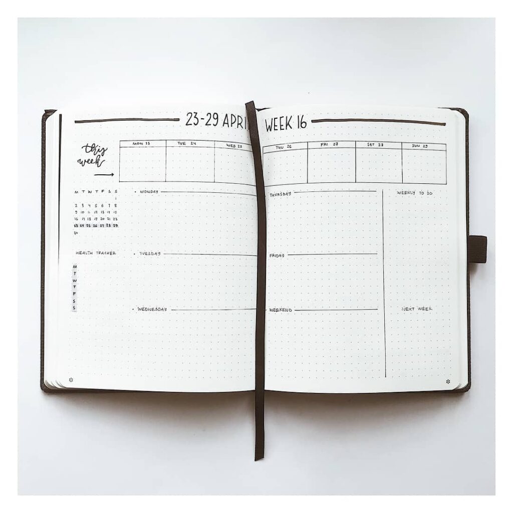
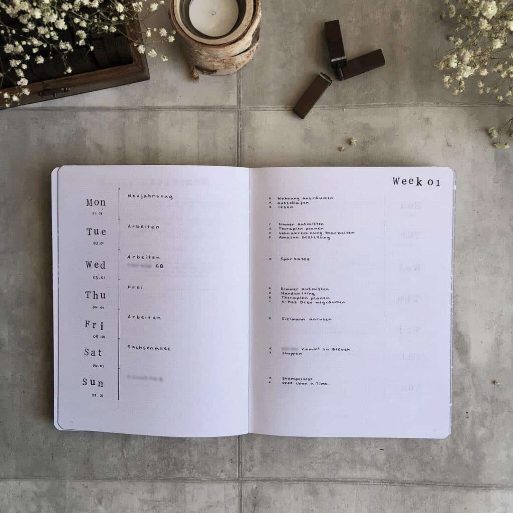
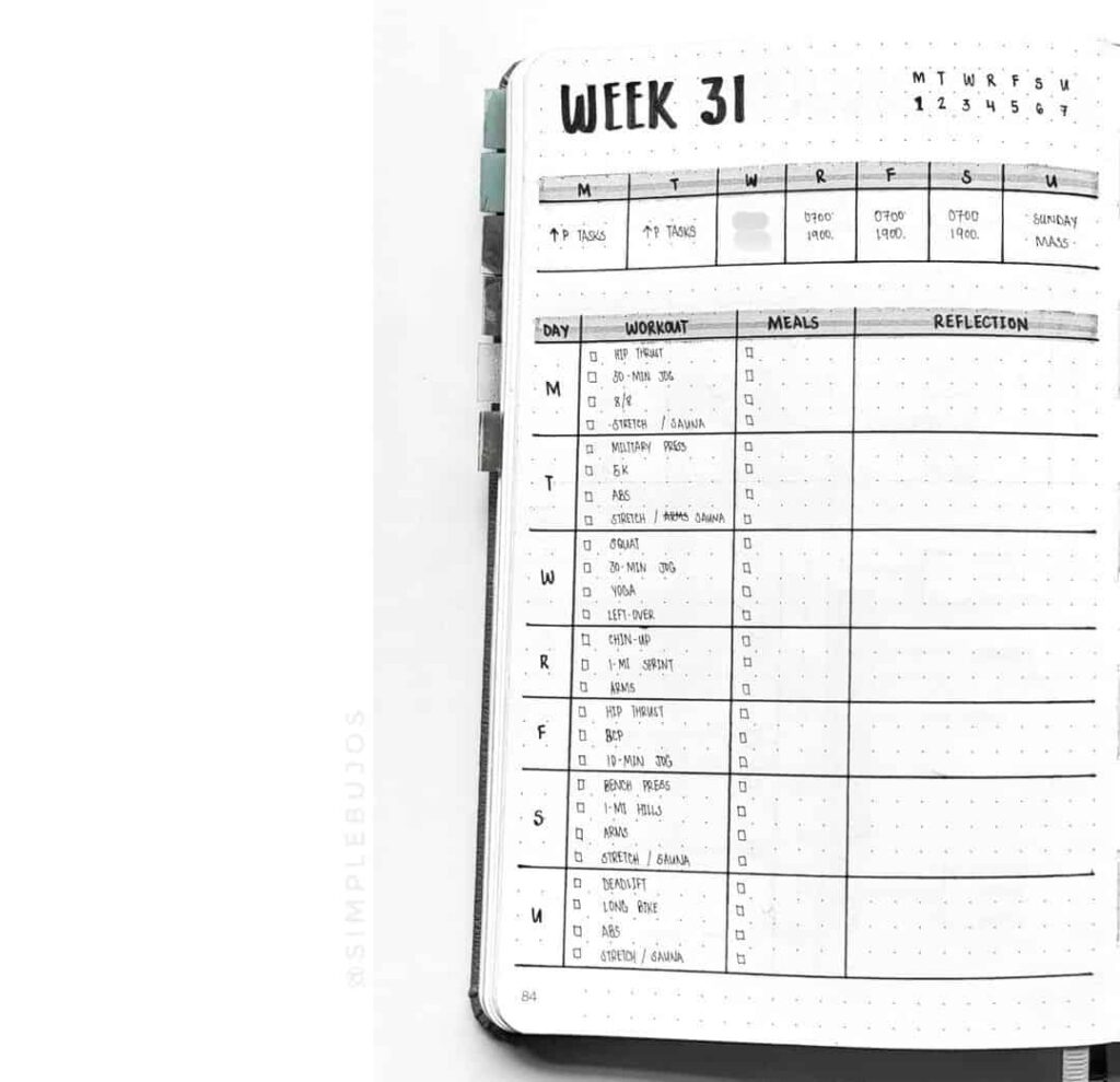
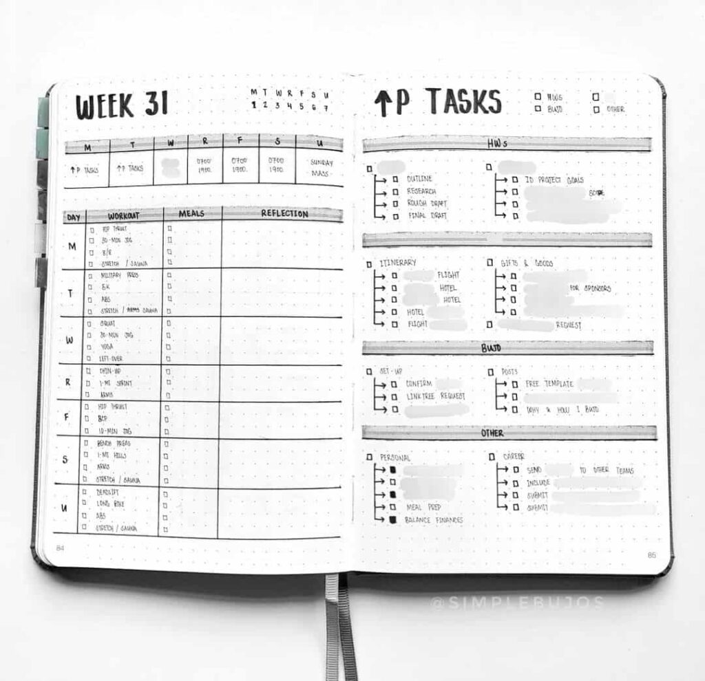
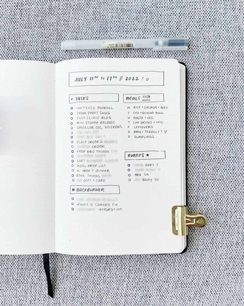
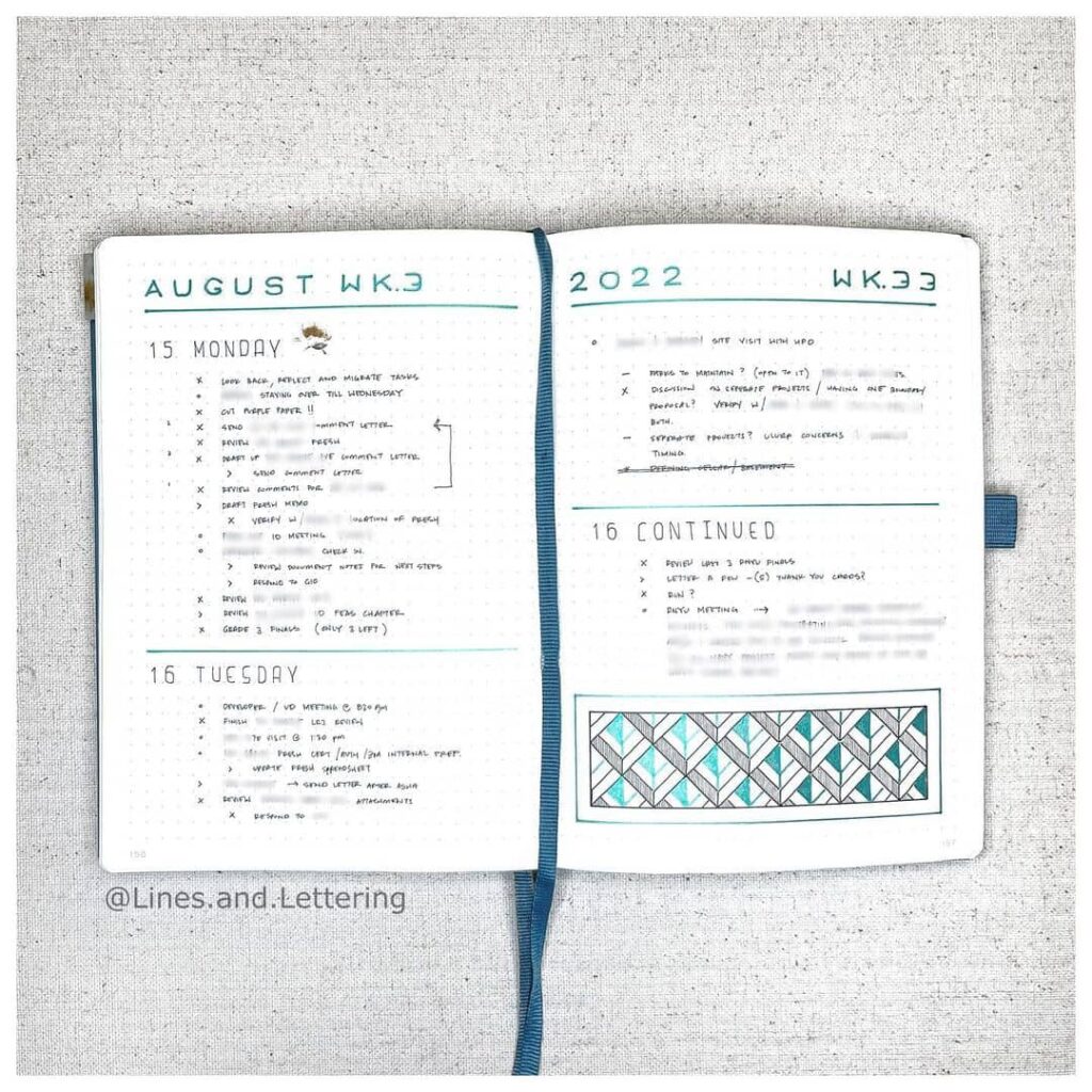
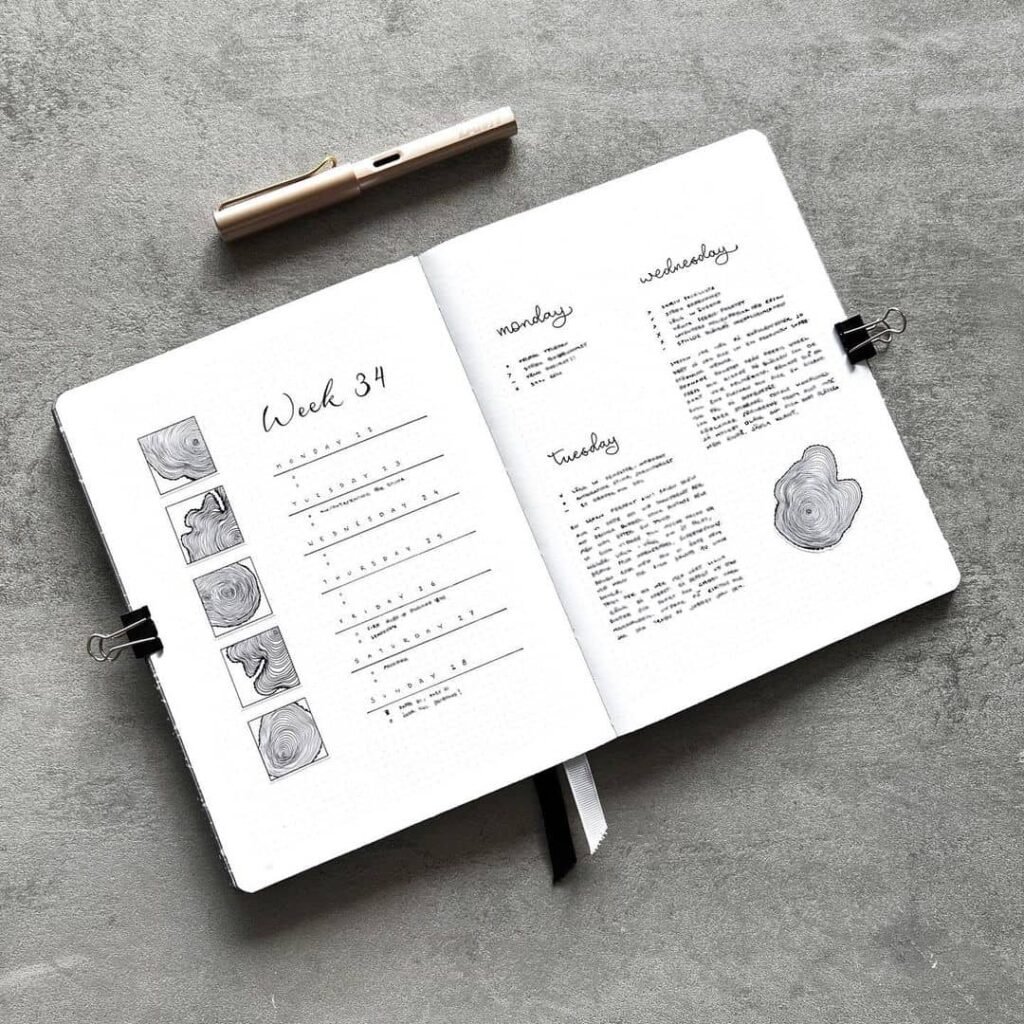
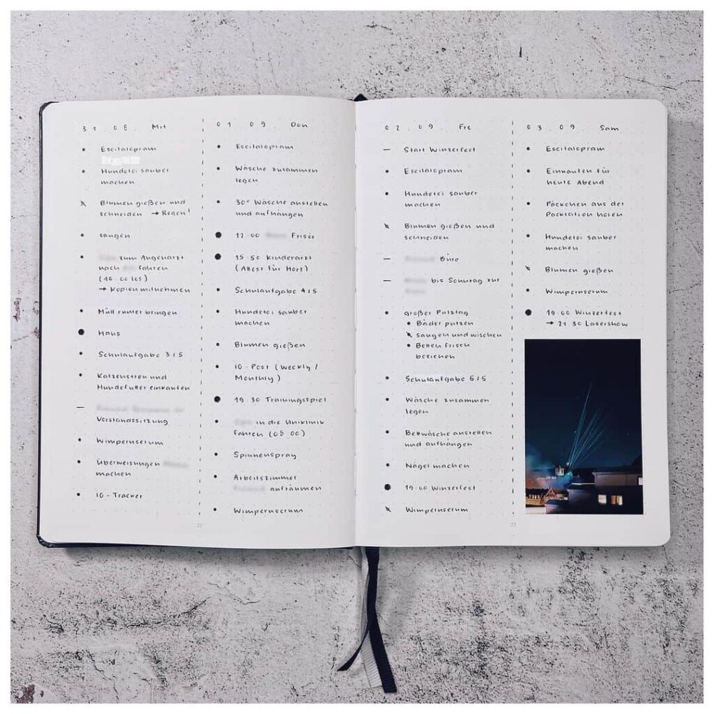
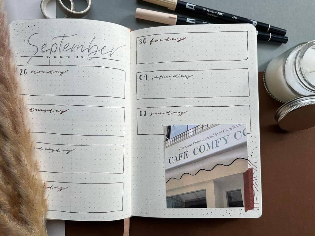
A two-column weekly spread is the workhorse of minimalist bullet journaling. The left column holds the days of the week; the right holds tasks, events, and notes. The whole spread can be set up in a few minutes and used cleanly for a full seven days.
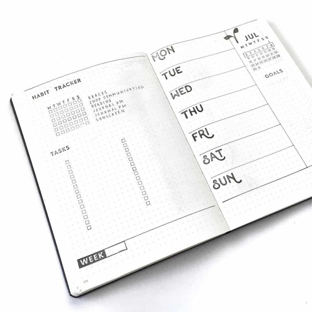
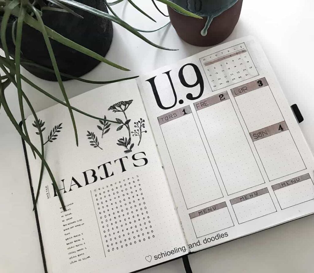
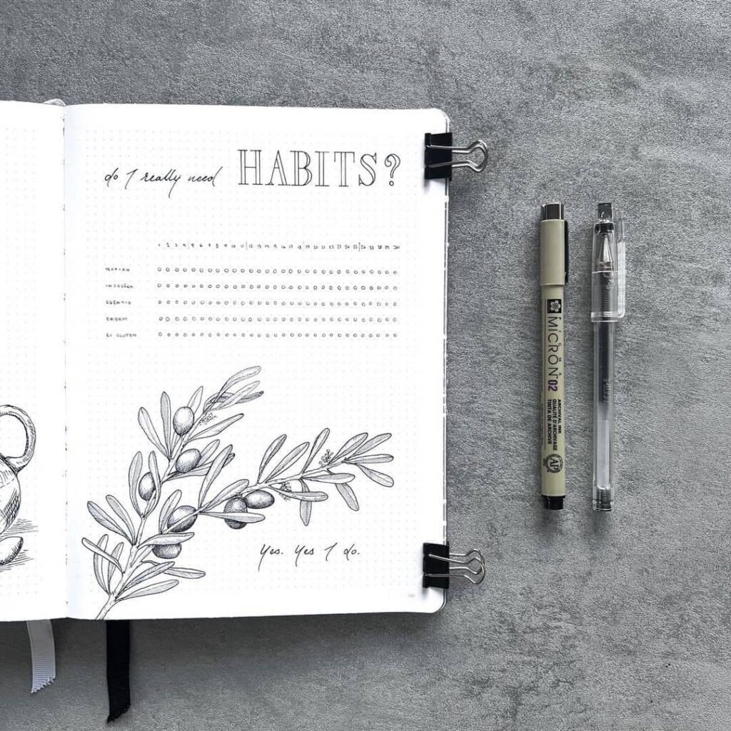
A minimalist habit tracker uses a plain grid with columns for the days of the week or month and rows for the habits being tracked. Boxes get filled in with a pen or a coloured square. The lack of visual distraction is part of the point; the eye goes straight to the row, not to the decoration around it.
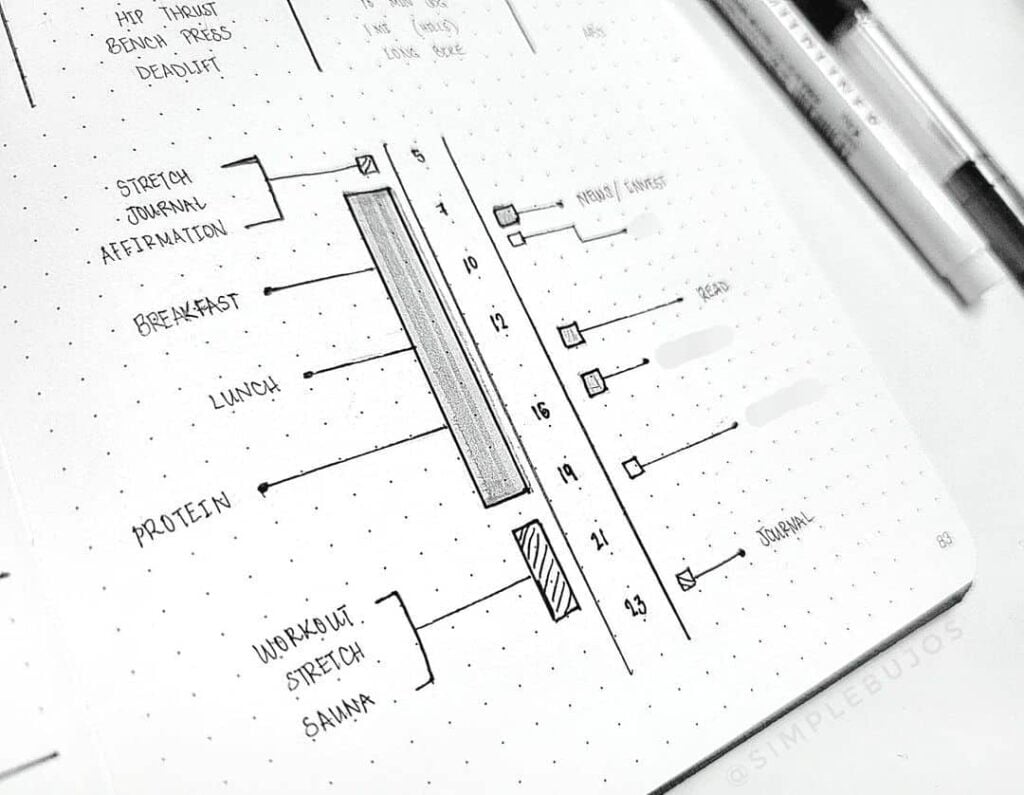
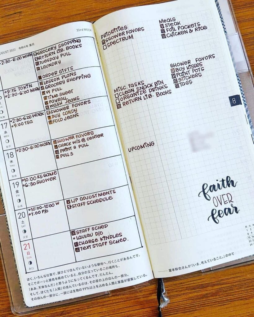
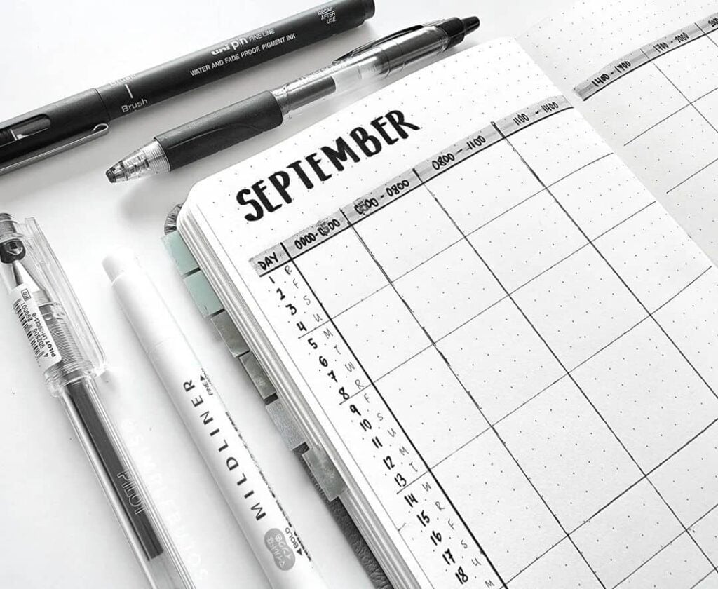
A time-block spread divides the page into horizontal sections representing parts of the day. Appointments and tasks are placed in the relevant blocks. Used over a week, the spread makes it easier to see where the day’s time is actually going.
A weekly focus spread reserves a small, prominent area at the top of the page for a single goal or intention. The rest of the spread runs as usual; the focus sits as a quiet reminder above it.
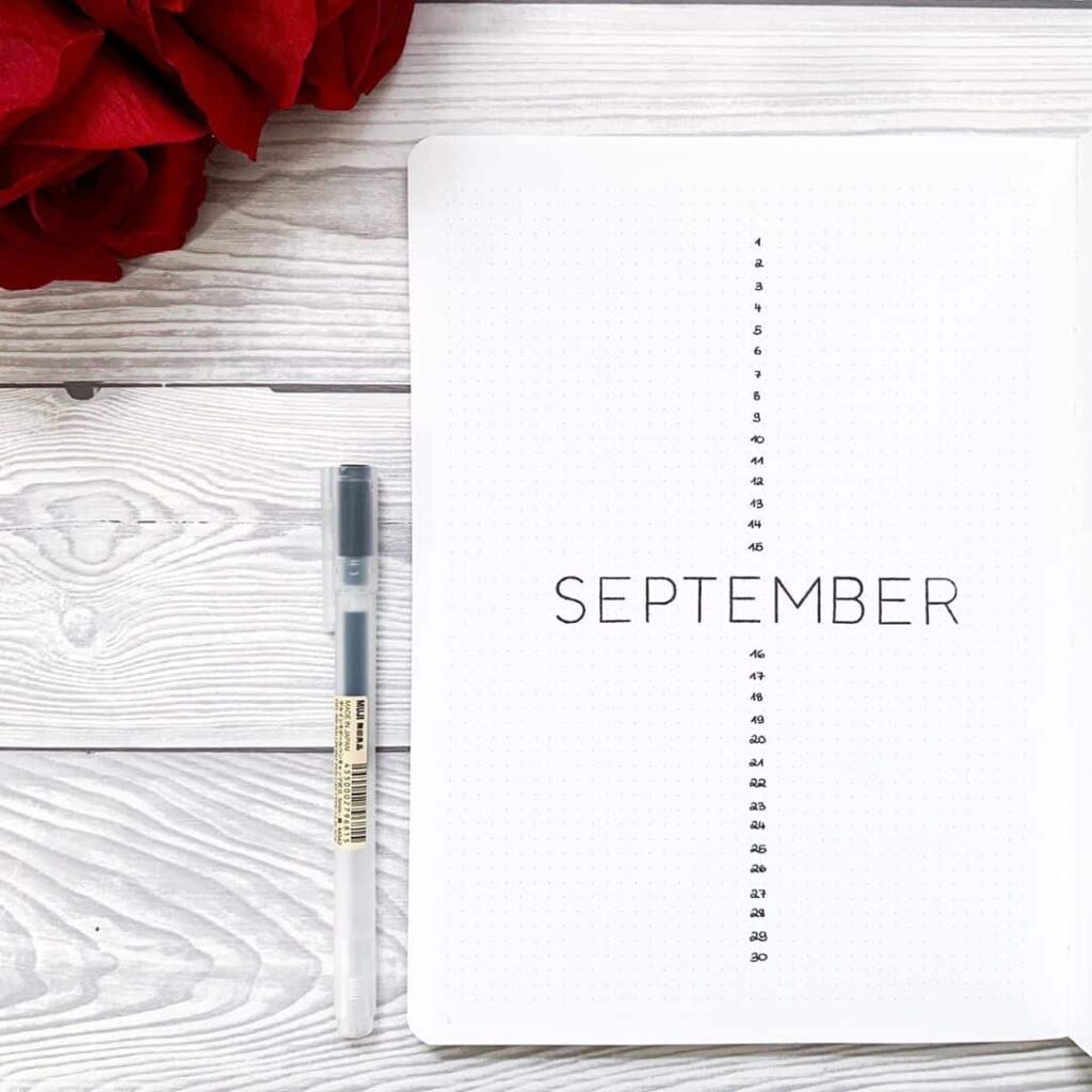
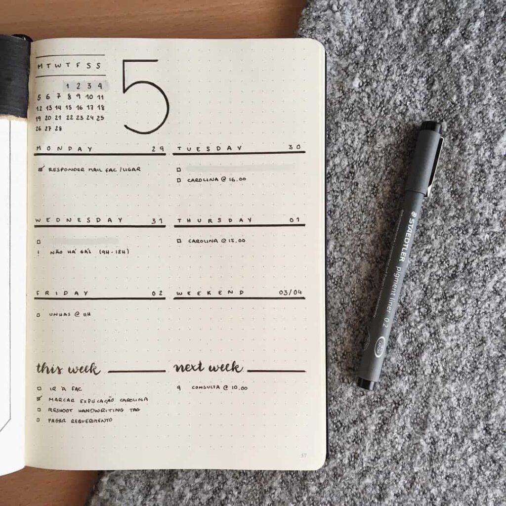
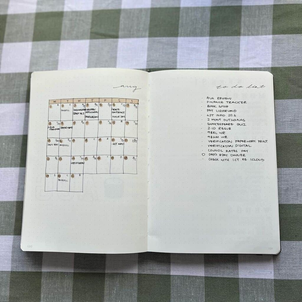
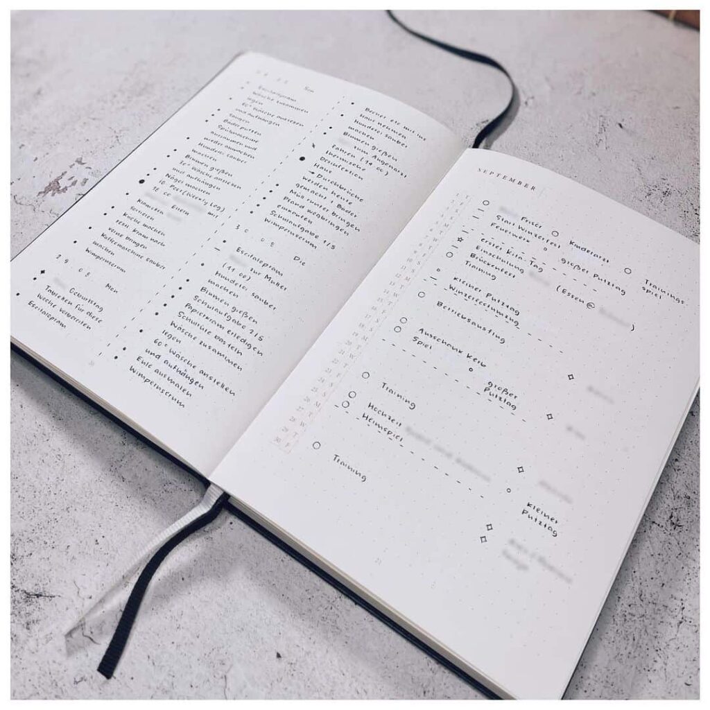
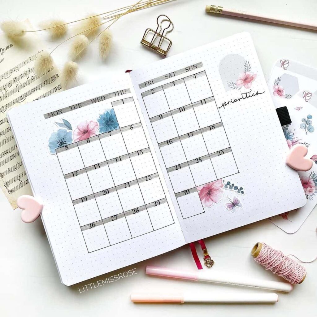
A monthly overview shows the entire month on a single page, with a grid where each box represents a day. Events and appointments are noted with short labels or icons. The page is dense without being decorative.
A minimalist mood tracker uses a linear or grid design with one slot per day, filled in with a colour or symbol that represents how the day felt. Over thirty days, the page becomes a small visual record of the month.
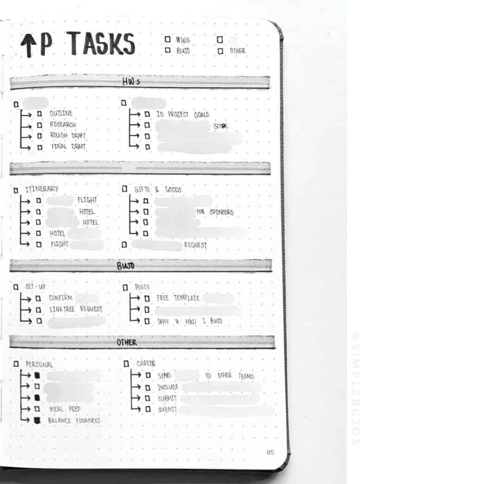
A project tracker uses a minimalist timeline or task list to manage work across multiple weeks. Tasks are listed, deadlines are noted, and progress is marked with a simple checkbox or shaded bar.

What to look for as you browse
The sixty-five spreads below come from the original My Inner Creative community and span several years of posts. Scrolling through them in one sitting makes patterns visible that would be hard to notice otherwise. A few things worth paying attention to as you look:
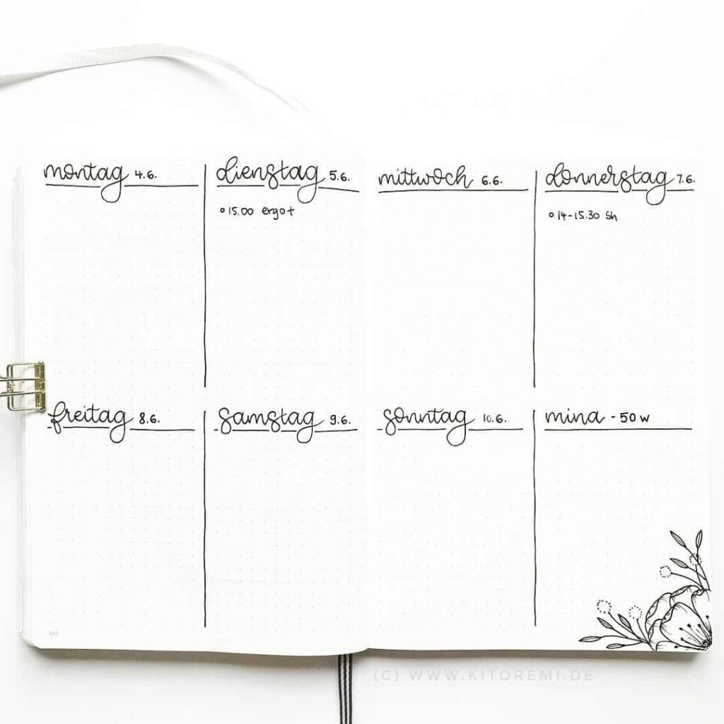
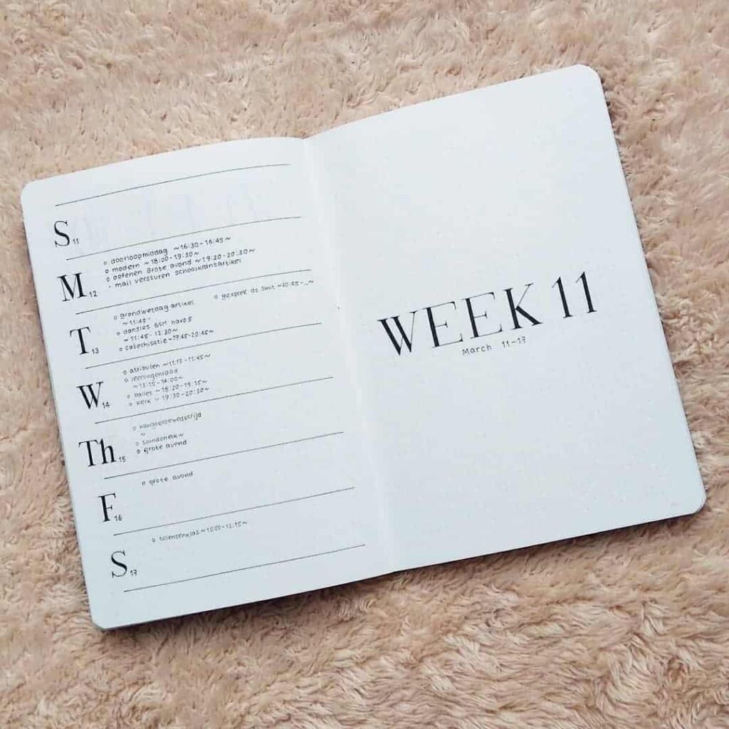
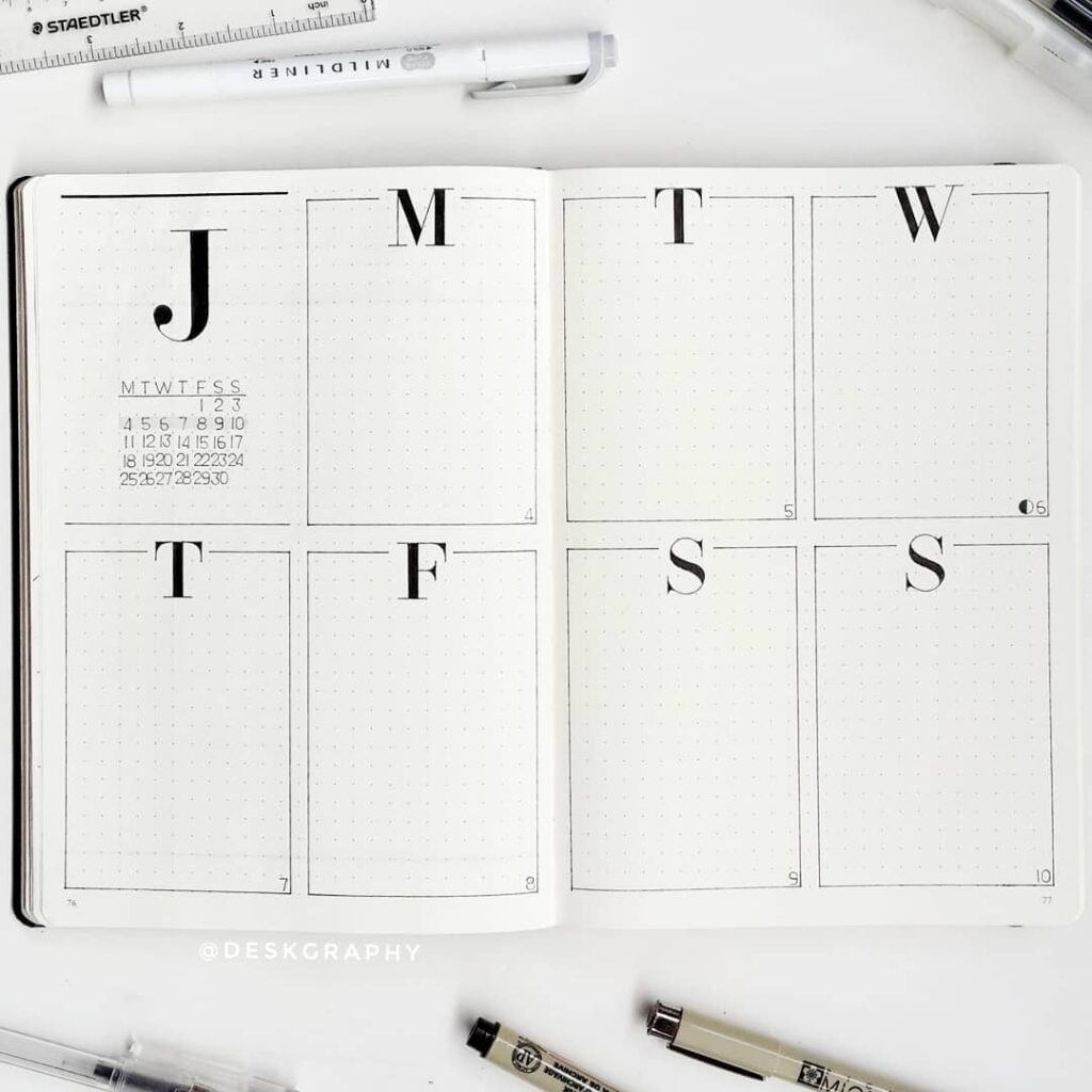
How headers are handled. The single biggest visual decision in any minimalist spread is whether to hand-letter the headers or print them. Hand-lettered headers take longer but give the page warmth; printed capitals are faster and more consistent. Most spreads in this collection use printed or ruled headers, which is part of why they hold up week to week without becoming a chore to maintain.
How much white space is left. Counter-intuitively, the spreads that look cleanest tend not to be the most sparse — they are the ones that have used their white space deliberately. A generous margin, a gap between sections, or a column that ends before the page edge all signal that the layout was planned rather than filled in. Watch for where each spread chooses to stop.
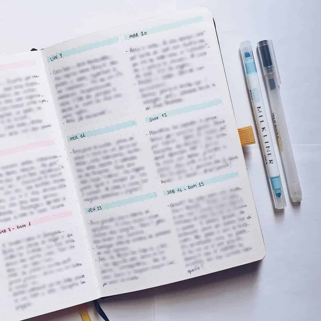
What a single accent colour does. Many of these spreads use one colour beyond black ink: sometimes for headings, sometimes for the habit tracker fill, sometimes for a single underline or border. The effect is disproportionate to the effort. A second ink colour costs almost nothing in time but shifts the page from a rough draft to a finished layout. Spreads that use it well tend to use it consistently in one role only.
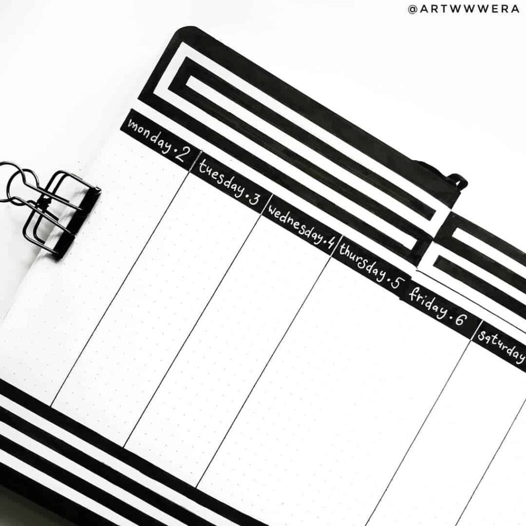
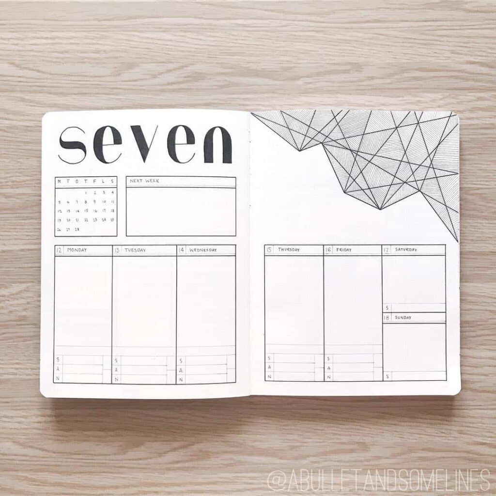
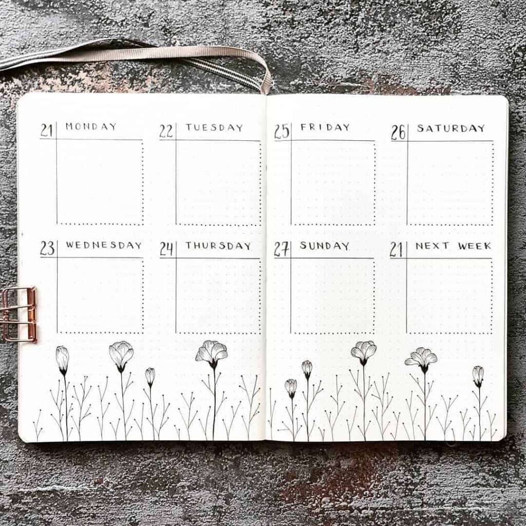
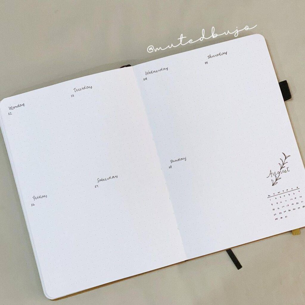
How the week is divided. There is no single correct way to represent seven days on a spread, and the collection reflects that. Some spreads give each day equal space in a vertical list; others compress the weekend into a single column; others break the week into two rows of three plus one. Each division implies something about how the person using it thinks about their time. Finding the version that matches your own week is one of the more useful things this kind of browsing can do.
What the tracker designs have in common. Habit trackers in minimalist spreads almost always use a simple grid rather than a decorative form — thirty boxes, each representing a day, with the habit name on the left. What varies is the grid line weight, whether boxes are filled or checked, and whether the month runs top-to-bottom or left-to-right. The choice affects how quickly a partial month reads at a glance.
Featured minimalist bullet journal spreads
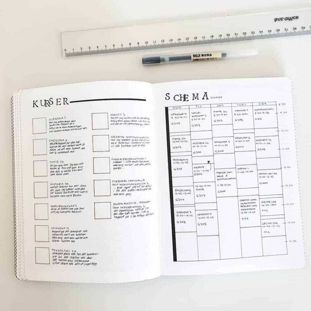
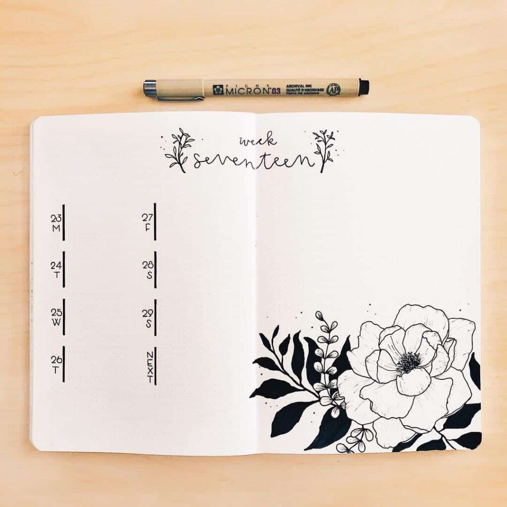
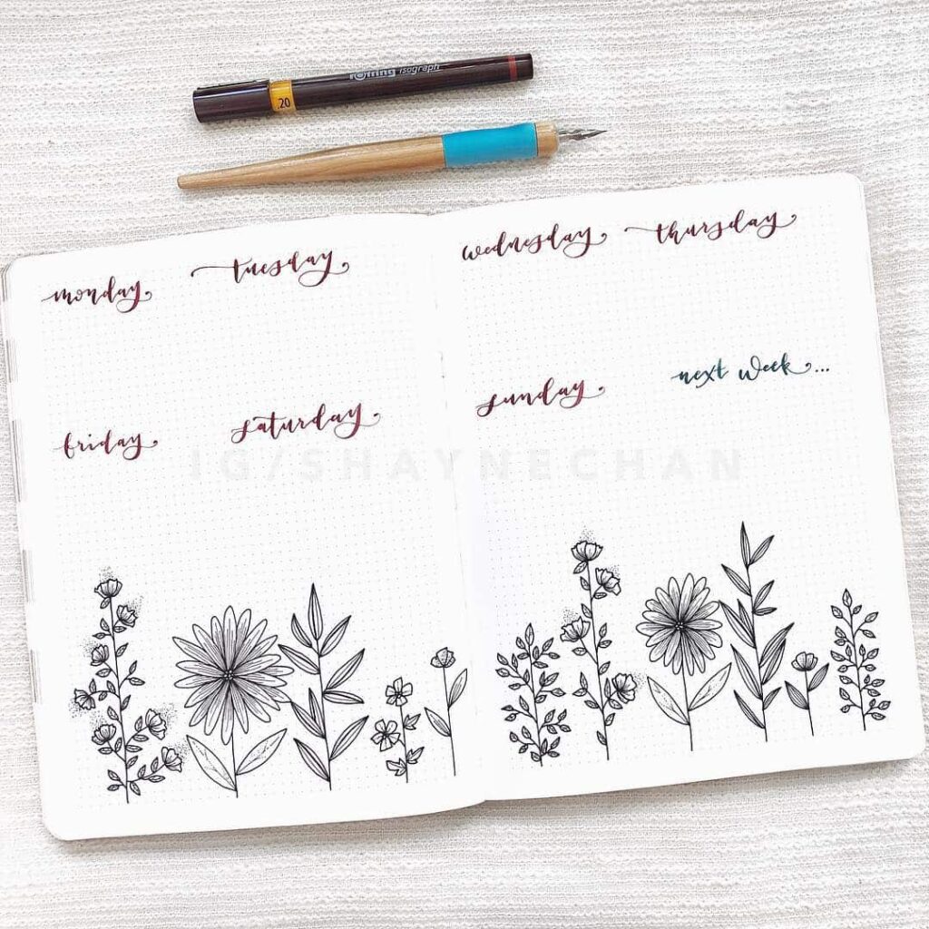
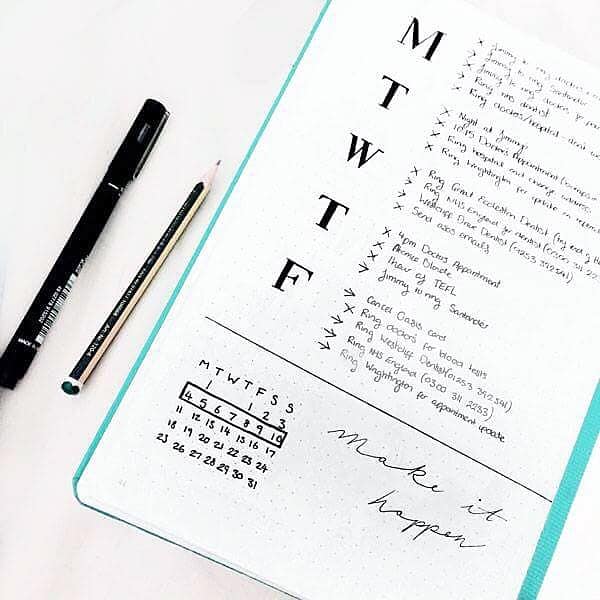
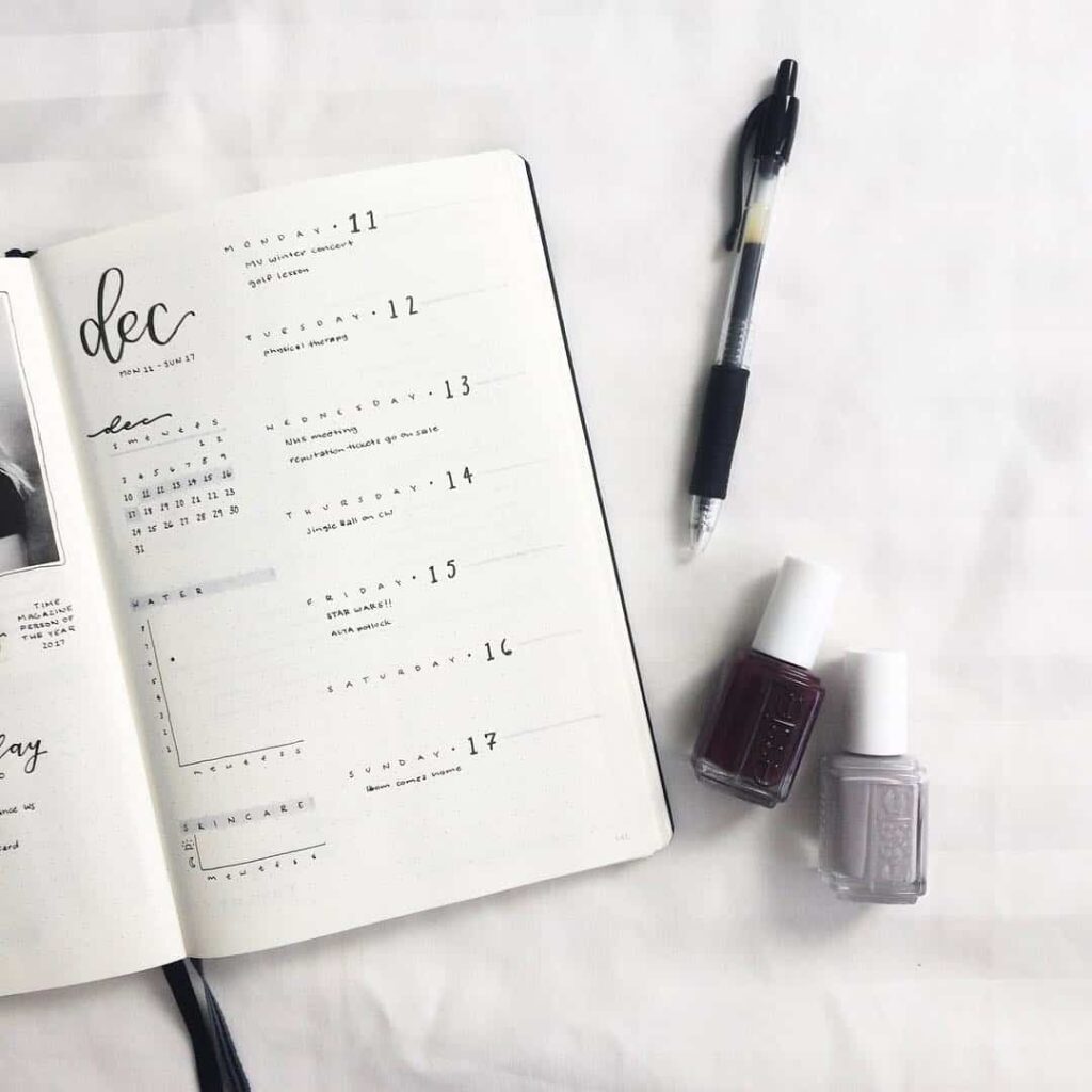
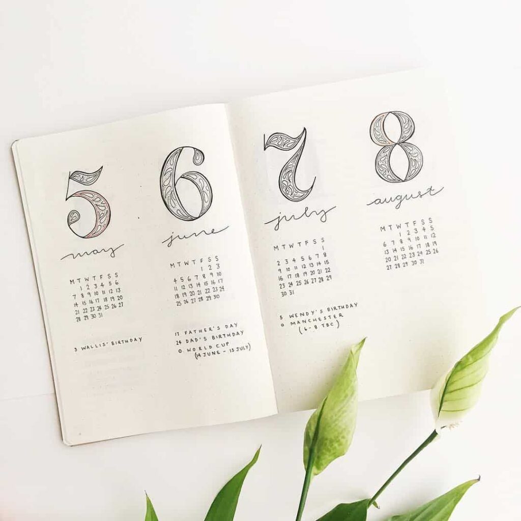
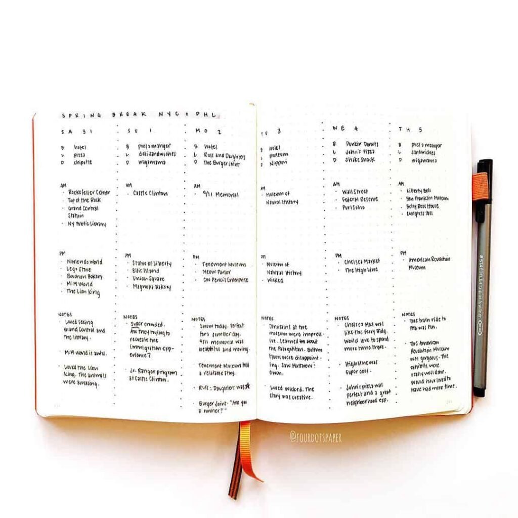
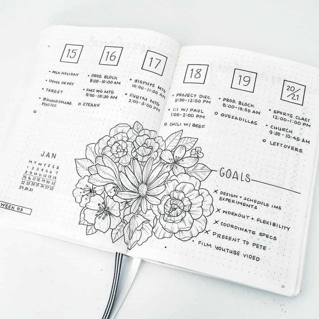
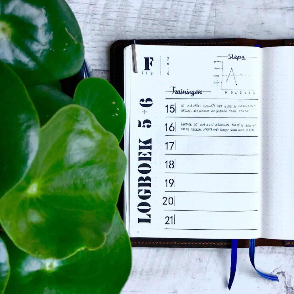
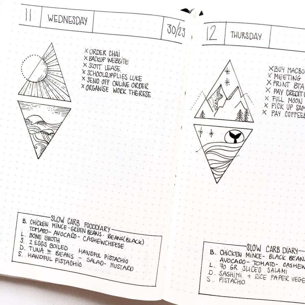
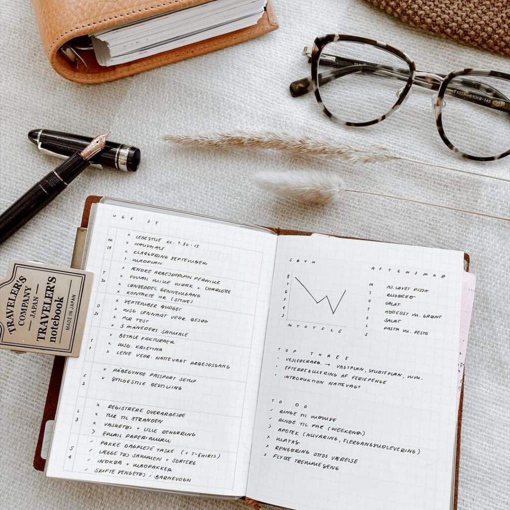
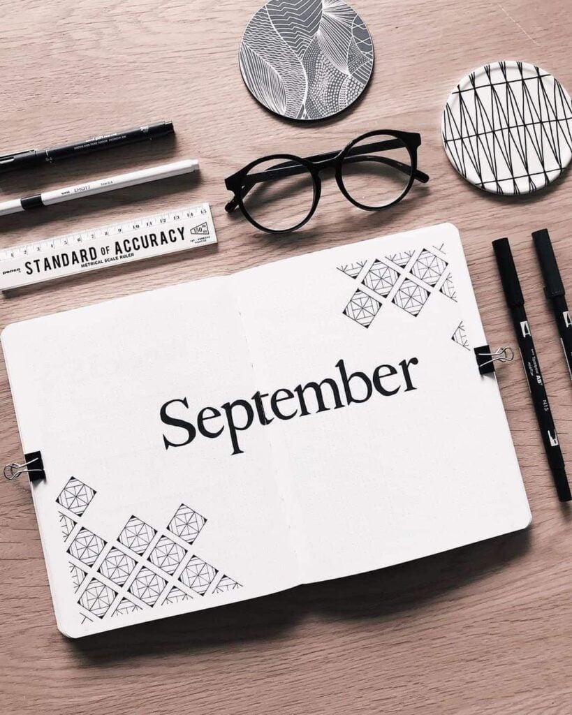
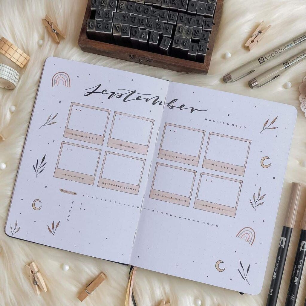
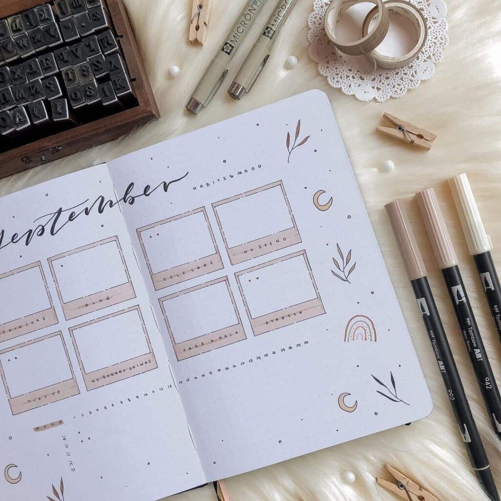
The gallery below pulls together sixty-five minimalist bullet journal layouts originally collected by the My Inner Creative community. The styles vary widely while staying within the same broad register: clean grids, sparing use of colour, neat hand-printed labels, and the occasional small flourish. Some are heavily structured; others use little more than ruled lines and dates. The breadth is what makes the collection useful. Anyone considering a more minimalist approach to their own notebook will probably find at least one layout close enough to copy directly, and several others that suggest where the approach can be taken with a bit more practice.


























How to use what you’ve seen
Looking at a large gallery of spreads is useful precisely because you are not looking at one recommendation — you are looking at many people’s independent answers to the same problem. The value is in the comparison rather than the individual example.
A practical way to work through what you have seen: identify the single spread that felt most immediately usable, and ask what specifically made it feel that way. Usually it will be one feature — the column width, the way the days are labelled, the absence of decoration in a particular area. That feature is the thing worth carrying into your own notebook, regardless of what else the spread was doing.
A second useful question: which spread went furthest from what you would have designed yourself, and did it work? Layouts that feel slightly foreign — a very narrow daily column, a tracker that runs sideways, a focus box placed at the bottom rather than the top — are often the ones worth attempting at least once. The minimalist constraint means they are cheap to try. A spread that does not work is just a page; the next one starts fresh.
The spreads here span several years of community posts, which means they also represent several years of refinement. The ones that kept appearing in different hands and different notebooks are the ones that proved durable in practice, not just attractive in a photo. A two-column weekly spread and a plain habit grid turn up repeatedly because they keep working for the people who use them, which is a better recommendation than any single review.
If you are starting a minimalist bullet journal for the first time, the most useful thing this collection can offer is permission to start simply. None of the spreads that hold up over months are the ones that required the most effort to set up. The ones that last tend to be the ones that were easy to open on a Tuesday evening and fill in quickly — and then easy to open again the following week.
Minimalism in a bullet journal is less a style choice than a quiet acknowledgement of what notebooks tend to need to do well. They have to be opened often. They have to be filled in quickly. They have to be useful next month, and the month after that. The spreads collected above show what that looks like in practice across a wide range of hands and weeks, and any one of them is close enough to copy to be a reasonable starting point. The rest is mostly a matter of returning to the page.